
.svg)


What Is Color Theory? Clear Guidance in 2026
Color theory refers to one of the basic principles in designing that can be used to make compositions that are pleasing to the eyes and work. The key to the correct colors choice should be the understanding of the color wheel and harmony. It is useful to know how they engage with each other in order to communicate your point and induce the desired emotions.
We shall seek to know more about the color theory, the various types of color wheels, schemes, color wheel components, the use of color effectively in designing, and so on.
What Is Color Theory?
The theory of color is concentrated on the blending of various colors that are good in designs. It relies on three concepts; relationship of colors, color wheel, and context of their application.
The color wheel shows us the primary colors in color red, blue, and yellow and the secondary colors in the following sequence namely the green, orange, and violet colors. Stringent balancing of designs can also be done through the complementing colors which are directly opposite to each other in the wheel.
Color harmony can be defined as the ability to choose the colors that appear to match or to be compatible. The appropriate choice of colors creates an impression of relaxation, vibration, and excitement. Colors used are determined by the mood, purpose and the audience targeted by a design. These tenets produce attractive and efficient designs in the process.
What Is a Color Wheel?
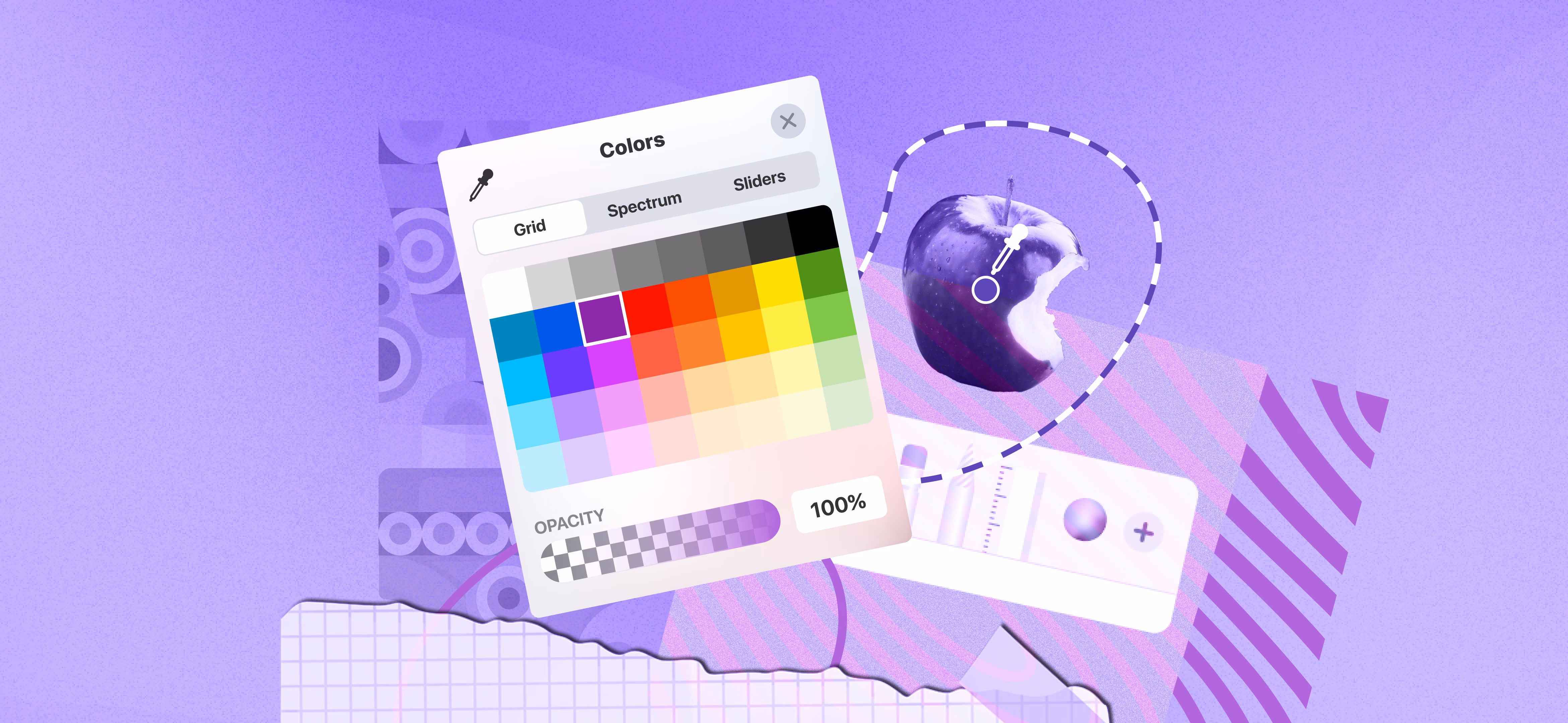
The relationship between colors and their interaction is understood in a color wheel. Color wheels are of two kinds additive and subtractive. The major emphasis of the additive color wheel is associated with light and the different wavelengths of light. It describes the way in which various colors are created as a result of mixing primary light colors such as red, blue and green.
Nevertheless, the subtractive color wheel conveys the way of making colors by depriving light by using colorants like paint, among other pigments. This color wheel has been used by artists and designers to come up with various shades and tones.
Types Of Colors On The Wheel
The Color wheel is an extremely advanced learning aid of the association of colors. The tool also comes in handy to designers and artists to decide on good combinations. We will look at the primaries, secondary and other colors within the wheel.
Primary Colors
The primary colors of the color wheel are yellow, red and blue and these are the base and the genesis of the color wheel. These are the bricks in creating all the different hues and cannot be created due to the combination of other colors. These colors give the designers a vast amount of shapes and tones. The secondary colors can be blended to give the tertiary colors and so on.
Secondary Colors
These colors, orange, green, and purple, are the secondary colors that are in the middle between the primary colors in the wheel. The colors provide additional color schemes and this can be implemented in design project development.
Tertiary Colors
Tertiary colors form as a result of a combination between a secondary color and a primary one. One of them would be a mixture of red and orange producing a reddish-orange shade; another one would be yellow, green or blue-violet. The greater number of the color levels enhances the overall looks of a design as the hues are more dynamic and predetermine the emphasis on some of the elements of the composition.
Analogous Colors
Similar colors occur side by side on the color wheel. They have the same values and colors and, consequently, can be blended with ease when designing. They tend to have a non-conflicting and non-clashing palette. One of the rules is combined with other secondary colors such as orange and yellow. The color dominating color, the secondary color, and the accent in this case are red, orange, and yellow respectively. The color combinations will be that of calm, warm and restful designs.
Complementary Colors
Complementary Colors are most intense when they are used jointly. Indicatively, blue and orange are complementary to one another since they remain in the wheel. When a design is done using complementary colors, it enables some parts to stick out and bring out an eye-catching bold design. They find application mainly in designs to help in capturing the attention of the viewers or attaining robust visual effects.
Ordinary Coloured Correlations
Other colors can be useful in triggering emotions and meaning depending on their location and context. The following are relationships between colors that are popular:
Neutrals
To give an example, the white will help eliminate the severity of the hot reds and cool blues and make them friendlier to the eyes. Neutrals also have a tendency of lowering the intensity of more dominant colors or constructively balancing them. They also provide important flexibility in designing seasonal themes such as balancing white to red and green during Christmas decorations.
Cool Colors
The cool colors such as blues, violets, purples, and greens tend to create a focus and relaxed atmosphere. They are allowed in areas or environments that are in search of tranquility.
Cool colors are always associated with cold and relaxing emotions and make them an ideal match in spa or treatment facilities. An example is a massage parlor where blue and green color would be used to relax the customers. The two figures seem ideal in their combination and contribute to the creation of space and depth.
Warm Colors
Warm colors are reds, oranges and yellows, which are identified with being alive, and power. These colors can be said to be very lively and vivid. They are inclined to excite, provoke passion or enthusiasm.
Warm colors make the atmosphere in the room friendly and welcoming, and this is why they are often applied in the areas where energy is required. Indicatively, a gym can include warm colors to encourage individuals and make them more concentrated on exercises.
What Is Color Harmony?
Color harmony in a design is a balance of colors in a design that makes it look well. To put it in a more basic language, it is the process of rendering a design beautiful to the eye. Unified, attractive and friendly designs may be reached by the use of effective balanced colors, and a bad performance may lead to a boring and messy design work.
Reasoning in the middle of these extremes is a guarantee of harmony. This form of balance makes it enjoyable to the eye and does not overwhelm the observer. The balance of visual appeal in the creation of harmony of the web, logos, designs, and art could lead to a pleasing experience.
Different Color Model
Color models In mathematics and color science, color models refer to mathematical frameworks that define the way colors can be modeled as values or coordinates in a color space. Three color models prevalent include RGB, CMYK and HSL each with its own unique application and attributes.
RGB (Red, Green, Blue)
The color model, the RGB, is grounded on the idea of additive color mixing. The colors of this model are formed by mixing a combination of varying intensities of three primary colors i.e. red, green and blue. Each of the colors has a value of 0 to 255 with 0 being no color (absence of color) and 255 being full intensity.
The RGB model is often employed to digital displays including monitors, television sets and cameras since it is a direct reflection on the way light interacts in these devices. At full values of all three channels (255, 255, 255) the outcome is white and at full values of all three (0, 0, 0) the outcome is black.
CMYK (Cyan came Magenta Yellow and Black)
Color printing mainly relies on CMYK color model. It is grounded on the subtractive color model and this operates through the subtraction of different percentages of the basic colors of the white light.
In contrast to RGB, where colors are formed by light, in CMYK colors are formed by blackness of light with ink and each color black or takes away certain wavelengths.
As an example, the red, magenta, and yellow are absorbed by cyan, magenta, and yellow respectively. The reason behind the use of black is the fact that cyan, magenta, and yellow do not give an actual black color hence the usage of an extra black ink as a way of giving depth and clarity.
HSL (Hue, Saturation, Lightness)
HSL color model presents colors as a cylindrical coordinate system, and is more human intuitive in general. It uses three components:
- Hue: Refers to the actual color (0deg to 360deg in the colour wheel).
- Saturation: Fills out the strength or intensity of the hue (the range is 0-100).
- Lightness: This is considered to be light or dark when the color is black (0 percent) and white (100 percent).
The HSL model is common in graphics design and image manipulation since it is easy to manipulate the color without altering its essential features such as hue, by modifying lightness or saturation.
Colour, Tint, Tone and Shade- How they are upon one another?
Colour is the base hue. A tint is created by adding white, a shade by adding black, and a tone by adding grey. These variations change the lightness, darkness, or intensity of the original colour while keeping the same core hue.
Hue
Color is simply another word of hue. It is the fundamental color that we perceive such as red, blue, yellow, and green. These are parts that are of varied colours. Then when somebody asks, What is the color of that? They are asking about the color. The hue is characterized by warm colors such as red or cool colors such as blue, which determine the character of the color.
Tint
A tint is formed by combining a color with white, a color, which is not as dark as the color. As an illustration, combine red and white. You get pink. That pink is a tint of red. It is the same color but light. The lighter it is the whiter it is tinted. Soft colors and pastel colors are usually tinted. They look calm and soothing.
When it comes to graphic design or painting, one can produce various tints to make their work soft. An addition of a tint can make a color light or easy-going.
Tone
When grey is combined with a color, the tone is achieved. Gray dilutes a color, puts depth
and makes it soft. Like, blue mixed with grey you will have a darker, lighter blue. That's a tone of blue. The colors are not bright and vivid as the original one. They are able to give a color a more sophisticated appearance. Tones work well with the designs that require to be relaxing or business-like. In your designs, you have a greater variety using tones. Rather than pure colors, the tones can be applied to give an elegant appearance.
Shade
Black is added to a color, thus producing a shade.For example, add black to red. You will have the dark red, that is, maroon. The dark red is a shade of red. The darker the shade the blacker you are. The tints can bring about a dramatic or mysterious impression to your designs. They are also able to make colors appear richer and deeper. Shades are employed in creation of contrast and emphasis in design. The darker hues are more prominent and statement.
Wrapping Up:
Color theory is more than just choosing colors that look good together. It’s a strategic tool that helps designers communicate emotions, guide attention, and create meaningful visual experiences. By understanding how colors interact, how they influence perception, and how different combinations affect mood and usability, designers can make more intentional design decisions.
In 2026, as digital products, branding, and user experiences become more sophisticated, color theory remains a foundational skill. When used thoughtfully, it can strengthen brand identity, improve readability, and make interfaces feel more intuitive and engaging.

Read our latest blogs and resources


Reach Out Anytime Connect with Our Team
.svg)


