
.svg)
Top 10 Fintech UX Design Best Practices to Boost Conversions in 2026

Top 10 Fintech UX Design Best Practices to Boost Conversions in 2026
By far, acquiring users has never been more easy and maintaining them harder. Frankly speaking, despite powerful technological foundations, compliant systems, and aggressive product development schemes, fintech UX design can be the largest factor to stop or lose customers when using core functionalities.
Consumers today demand online money management experiences that are free of hassles and comforting. Maintenance not up to that mark... they will switch, uninstall or even give up on the app. In case you are tasked with leading growth or digital transformation within your fintech or BFSI company, you are already feeling the pressure of bringing about experiences that bring about actual financial clarity.
The guide divides the 10 best practices
In fintech UX design, any team needs to apply specific examples supported by real-life examples and modern UX patterns. Such as:
1. Hyper-Personalization by AI and Behavioural Insights
Finentech UX AI is the machine that is behind personalization, insights, and financial planning. The finest fintech applications in 2026 will provide:
- User-customized dynamic dashboards.
- Anticipatory proposals (Such as: You may hit your savings goal in time)
- Automated spending forecast and categorization.
- Onboarding, which is based on user behavior.
- UX Pattern: Personalization, Adaptive.
Fintech UI/UX Best Practices:
- Use behavioral segmentation, rather than demographic segmentation.
- To be able to predict, add confirmation either levels (Example: We are 85% sure you will get where you wants to be...
- Some personalization is too creepy. Give reasons why a recommendation is presented.
- Value-based personalization (e.g. objectives, likes, dislikes) should take precedence over cosmetics.
Real Example:
Revolut utilizes behavioral insights to tailor the notifications, card management and budgeting suggestions.
2. Enhancing Confidence in Open, Anthropocentric Processes
Trust is retention in the world of fintech. The slightest message or mysterious number may give an immediate alert and users will leave a task or quit using the product completely. Clearly fintech UX design is making sure users know always:
- What’s happening
- Why it’s happening
- What it means for them
- Pattern: Radical Transparency.
- There is early unveiling and clear release of information in order to minimize uncertainty.
Fintech UI/UX Best Practices:
- Only plain-language microcopy should be used in fees, risks, wait times, and next.
- Introduce transparency controls, particularly when performing KYC, transfers, or payments.
- Calculate fee, exchange rate or interest in simple form.
- Preview show (say, terms of loans, transfers, investments).
- Earmark safe locations using recognisable badges, lock symbols and optional signs of reassurance.
Real Example:
Wise is very much successful in the clarity of fees, diagrammatically presenting the exchange rates and fees in advance.
3. Passionless Onboarding and Smarter KYC
The largest make-or-bust moment of a fintech app is onboarding, when users are looking to open an account, transfer money, or get verified and do not have to fill in details and upload documents several times. Now, we will have a look at the current KYC expectations:
- Minimal manual typing
- Smart OCR and autocomplete.
- Instant authentication where feasible.
- Obvious states and progress bars.
- Pattern UX: Progressive Disclosure KYC.
- Present information bit by bit to avoid overwhelming the users.
Fintech UI/UX Best Practices:
- Break is subdivided into one-step screens in order to alleviate mental load.
- Live validation will ensure end of life errors are avoided.
- Allow users to save the progress and finish later onboarding.
- Add pictorial verification: This information is actually encrypted and safe.
Real Example:
Onboarding is a single-question process to maintain momentum and minimize drop-offs at Cash App.
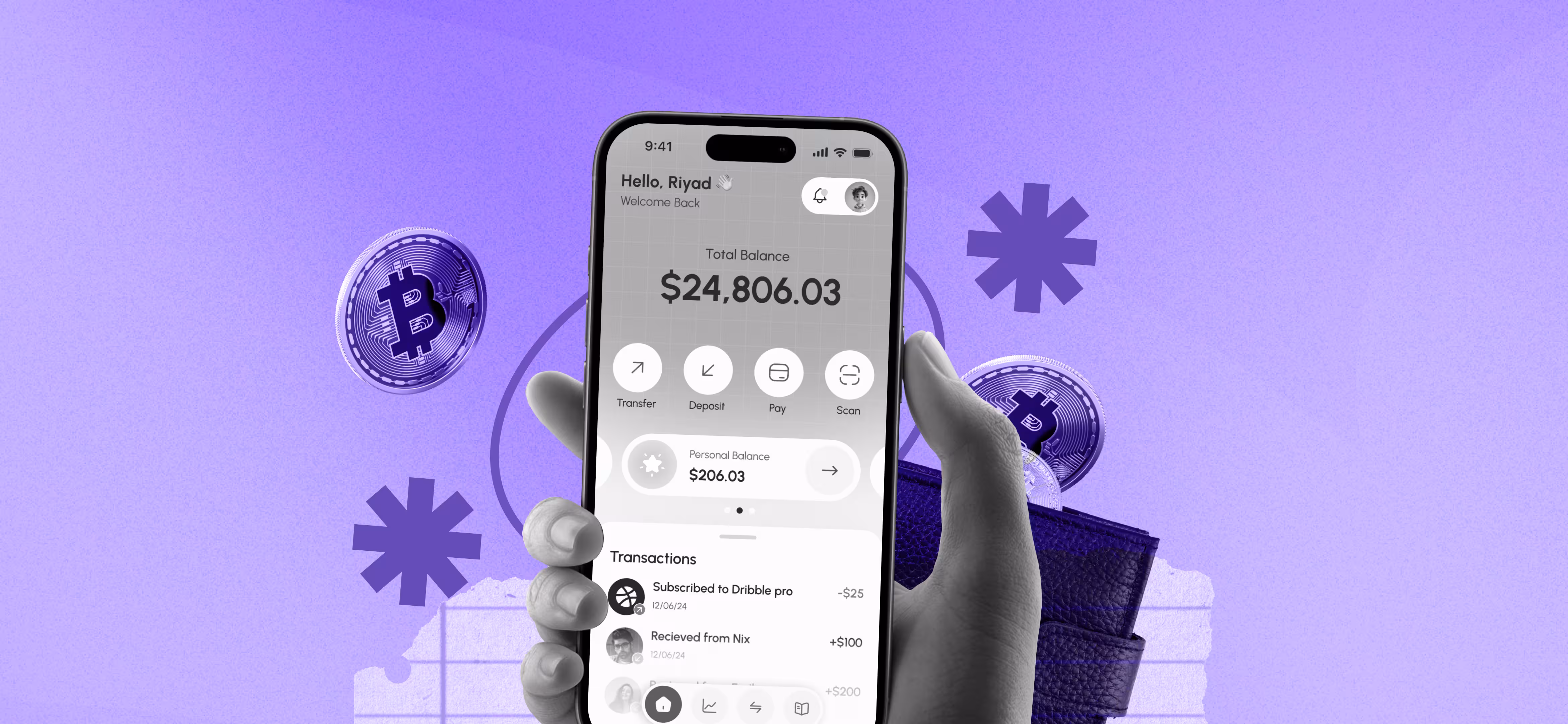
4. Less Maximum User Interface
Financial work is mentally challenging in nature. Ensure that your UI does not contribute to that. The design of a fintech product is minimalistic, so users do not lose their attention in details. The key UX design strategies, in this regard, are:
- A lot of white space to minimize visual stress.
- High visual hierarchy to enable users to recognize important numbers immediately.
- Minimal use of color as color should not be used to ornament but to lead.
- Dashboard designs showing the step to follow.
- Applying soft gradients, bold typography, neutral palettes, minimal border, and smooth shadows as one of the fintech design trends 2026.
- Pattern UX Cognitive Simplicity Framework.
- Pay attention to the minimization of stimuli, intent explanation, and easy mental navigation of users.
Fintech UI/UX Best Practices:
- Predictability is created by using similar space and typography.
- Be certain about primary actions.
- Motivate out what does not support the financial decision of the user.
- In the case of informational states, use soft colors whereas in high-stakes actions use more aggressive colors.
Real Example:
Robinhood maintains the screens of investment decisions to a minimum with sparse use of whitespace and color.
5. An Intuitive Info-Arch and Task-Oriented Navigation
Users brainstorm in tasks, and, naturally, not in internal structure of your app. Thus, the navigation should incorporate actual mental images of money management. Users mostly do:
- Send or receive money
- Track income & expenses
- Pay bills
- Invest or withdraw
- Manage cards
- Review insights
- Patterning: Intent-Based Navigation.
- What users desire to achieve is first priority rather than trying to force them to use what you desire them to use.
Fintech UI/UX Best Practices:
- Plan navigation based on core user tasks, but not on product departments.
- Smart shortcuts are provided on the basis of recent behavior or projected intent.
- Use contextual CTAs (e.g. Pay Upcoming Bill, Add to Savings Goal).
- Minim navigation and have essential functions which are a single tap away.
- Provide breadcrumbs or location contextual clues to the user.
Real Example:
Nubank stores payments, card information and invoices in real time, enhancing interactivity.
6. Financial Anxiety Reduction through Emotionally Supportive UX
This is because when users are uncertain or at risk, the slightest friction will lead to anxiety. Emotion supporting UX brings about sensation that is soothing, secure and comforting. This is the way mobile banking UX helps to eliminate anxiety:
- Aim at soft, empathetic microcopy.
- Reinforcement should be positive (You are on track)
- Add fail-safe states and vivid recovery routes.
- Do not panic until danger is eminent.
- Provide understandable explanations to difficult financial activities.
- UX Pattern: Soothing Design Framework.
- Reduce cognitive stress with the help of design interactions, particularly in high-risk circumstances.
Fintech UI/UX Best Practices:
- Apply the calm states to the large actions (say, payment completion).
- Comfort customers within waiting times (udate: Eg. This will be up to 10 minutes).
Real Example:
The AI budgetary assistant Cleo is also able to lessen the tension around finances by being humorous and providing positive feedback.
7. Affordable and Usable Fintech Design
The concept of accessibility has become a compulsory principle of designing fintech products. It is significant that financial applications operate easily, regardless of the ability of users who have different capacities, ages, gadgets, and literacy. Let us briefly consider the basic accessibility standards:
- High color contrast ratios
- Scalable, legible font sizes
- Voice input and voice search
- Screen reader alternative text and semantic labels.
- Explicit images to neurodivergent users.
- UX Pattern: Access to Finances everywhere.
- Make monetary experiences available to everyone, with or without ability.
Fintech UI/UX Best Practices:
- Consider WCAG 2.2 and future WCAG 3.0.
- Make bigger tap targets with older people or people with motor difficulties.
- Have various options of the paths that include visual, text, and voice.
- Accessibility to the test as UX QA.
Real Example:
Monzo has been known to use high contrast designs and clean typography to improve on readability.
8. Information Visualization that Enables Decision-Making
Fintech apps deal with complicated information but only make sure that complexity is not foisted on the user. Superior data visualization transforms unprocessed figures into coherence and assurance.
- Pattern UX: Analytics Actionable.
- The insights should be in a way that makes the users be directed to a decision or next action.
Fintech UI/UX Best Practices:
- Label charts and eliminate guesswork.
- Survey abnormalities or patterns (Ex: Your expenditure rose by 20 percent last month).
- Minimize the use of color to signify meaning.
- Easy access to all the information with easily noticeable affordances in case the user wishes to get deeper.
Real Example:
Mint converts this information about spending in forms of charts that reveal trends and opportunities.
9. Context-based Microinteractions and Motion Design
Microinterfaces are critical in fintech since they provide feedback to high-stake actions. These are payments, transfers, withdrawals and investments. Examples of microinteractions are:
- Light trembling or beating on payment being made.
- Budgeting screens Organizational budgeting screens should be enlarged with animation.
- Fluidness in tab or view switching.
- Real time confirmation of investment orders.
- UX Pattern: Contextual Microfeedback System.
- Make sure that motion is employed as functional feedback as this way users remain grounded and confident when dealing with money.
Fintech UI/UX Best Practices:
- Elaborate on space associations with movement.
- Enhance reliability of the reinforce system with micro-feedback.
- There should be no abrupt movements that can bewilder the user.
- Focus on performance because lag decreases trust.
Real Example:
Apple Wallet involves slight yet evident microinteractions to validate action such as card activation or payments.
10. Secure UX: Finding the Right Balance between Safety and Simplicity
Security is first but excessive security may cause frustration to the users and drop off will be on the rise. It is aimed at providing high levels of security with low friction.
- UX Pattern: No-Security Framework.
- A current fintech solution in which the majority of the security occurrence takes place in the background and only appears when essential.
- The trend lessens the cognitive burden and enhances trust, as it maintains protection on the offensive.
Fintech UI/UX Best Practices:
- Authentication (fingerprint, FaceID).
- Adopt device recognition to ensure smooth login.
- describe security measures in a clear way (Such as: We require this to secure your account.)
- Calmness, informative and solution-oriented states of design error.
- Offer other routes of verification to non-biometric users.
Real Example:
iMobile electronic banking by ICICI Bank combines biometric authentication with an ongoing device-level verification in the background.
Introduction to Fintech UX Design Practices in Your Product
1. Run a Fintech UX Audit
It’s important to focus on:
- Onboarding
- KYC friction points
- Navigation clarity
- Error rate analysis
- Data comprehension
2. Work Together: Product, UX, and Compliance
Fintech UX works when the design and compliance are aligned at the beginning.
3. Test With Real Users
Make use of:
- UX scorecards
- Task completion heatmaps
- Sensitive flows (payments, loans, investments) A/B testing.
4. Continuously Optimize
Fintech is dynamic. Therefore, take note of the fact that features are constantly changing according to information.
Wrapping Up:
The most innovative fintech products fail even when the teams do not pay attention to the basics of user experience. Thus, one should not fall into the following pitfalls:
- Crowding the dashboards with graphs.
- Hiding fees in microcopy
- Proceeding with design rather than financial issues.
- Using complex jargon
- Is unable to establish recovery paths of failed transaction.
- Trust and Innovation in Fintech UX Design Future 2026.
To get there, it needs a design team with deep fintech expertise, in terms of compliance, security, behavior science and practical user actions.

Read our latest blogs and resources


Reach Out Anytime Connect with Our Team
.svg)


