
.svg)
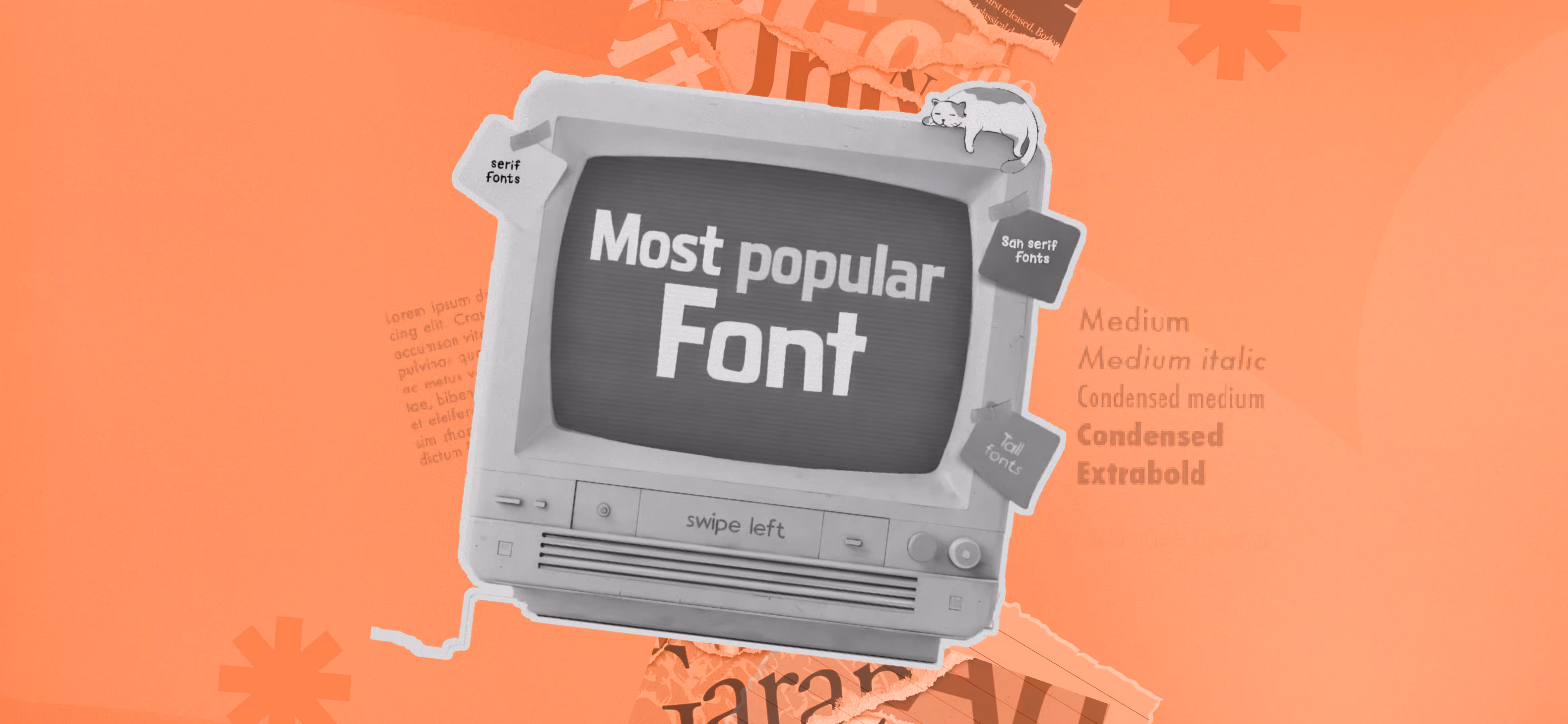

The following are some of the most popular and frequently used fonts on various parts of the design in 2026.
Best for Logos:
- Helvetica Now - It is a fresh and updated version of the traditional Helvetica that provides a clear cut and well-balanced appearance. It is a professional minimalist branding choice due to its sophisticated contours and better readability.
- Gotham- Ambitious but classy, Gotham has the authority. Its geometric design will give it a modern feel, which will suit brands that intend to achieve the perception of power, the present, and reliability. The 2008 Presidential Campaign of Obama, hoPE and Change posters were designed by Gotham to give a sense of strength and trustworthiness.
- Montserrat- The typography is a typeface that is inspired by cities; it is graceful with a modern stylish touch. Its legible and smooth letterforms make it ideal as a brand that is seeking a slick, familiar face.
Best for Landing Pages:
- Raleway- lightweight and uncomplicated, Raleway is something upscale with its slim lines and elegant characters. It is suitable with brands that desire a stylish but modern feel. The headings and CTAs stand out with ease due to the font.
- PT Sans- PT Sans is legible, and designed to give the user an approachable feel. It has good spacing provided readability and it is perfect on landing pages where visitors require to get an idea of the content at a glance.
- Avenir- A flawless mixture of vintage and contemporary, Avenir is high end. Its smooth and geometric curve lines are very professional and welcoming.
Best for Mobile Apps:
- Roboto - Geared towards online interfaces Roboto is a good font with great readable qualities on compact displays. It has a smooth flow and easy navigation due to the open nature of its structures and smooth curves.
- Lato- With his look at ease, yet professional enough, Lato is a combination of friendliness and modernity. The balanced spacing and clean format of the design increase readability.
- Inter- Inter is specifically designed to be used in the digital format, and it is very clear and efficient. It has has optimized letter spacing and sharp details, which make it easier to read even when using smaller font sizes. The font is also suitable in mobile UI elements.
Best for Website Design:
- Avenir - Contemporary and uncomplicated, Avenir provides smooth typography, which improves the legibility. Its moderate shape adapts well to headlines and body texts giving it a professional and smooth appearance.
- FF Kava- FF Kava is a unique stylish site that introduces a fresh touch to the web sites. Its unique letter forms bring out character and still have a very high readability rate which is very ideal in creative brands.
- Helvetica - Simple and easy to read, Helvetica is also a smooth reading typeface. Its systematized structure has made it flexible to all kinds of websites whether corporate or minimalist style.
Best Graphics in Social Media:
- Bold and eye-catching- Bebas Neue provides a lot of visual power. Its capitalization is such that it makes the headlines and social media posts immediately visible.
- Oswald- Fresh and organized, Oswald looks confident. It has tall letterforms that ensure maximum readability and is ideal to use in catching the eye posts and banners.
- Poppins - Simple and clean, Poppins are clean but stylish. The geometric format allows its text to remain readable but provides the social media design with a modern touch.
Significance of Typography in Design:
The effect of typography is felt in all the fields of design, including the formation of the brand image, as well as user navigation. We shall discuss the main reasons why typography is so serious in design.
1. Establish Brand Identity
Typography is the visual voice of the brand. The adoption of types, layout and style translates the personality and values of the brand. As an example, a technology firm can use smooth, modern fonts to portray innovation, whereas a luxury brand can use serif fonts to portray class. Regular application of typography on every media builds brand awareness and trust.
2. Increase Readability and Legibility.
The choice of fonts and changing them in size, spacing, and positioning directly influences the ease of text reading. The properly selected typography makes sure that the message can be read by a wide range of audiences, even those who have visual problems. As an illustration, a bigger font size and spacing between the lines can help in making reading comfortable and this is more so when using digital resources.
3. Create Visual Hierarchy
Typography assists in the organization of data through creating a visual hierarchy. The designers can control how the font, weights and styles vary to lead the eye of the reader to the most important aspects first. This systematic nature enables flow of information to be logical and this facilitates easy navigation and understanding of information by the readers.
4. Influence User Experience
Typography is essential in user experience (UX). The interfaces can be made more engaging and intuitive with the use of the appropriate font choices. An example is the on-screen use of a typeface such as the sans-serifs fonts because of their clean and modern look, and they can be easily read on the computer screen.
5. Create Mood and Invoke Feeling
Typography can be used to create emotions and tone of a message. A font can be used to show fun as a playful font, or be used to show existence as bold and in uppercase. Such an emotional attachment has the power to affect the reception and interpretation of a message by the audience.
6. Support Accessibility
Considerate typography design takes into account the issue of access, and hence, text should be readable and understandable by everyone, and even the disabled. The use of high contrast, selection of fonts to be readable, and spacing should make the content more accessible and reach more people.
The Ultimate Guide to Choosing the Right Typeface on your Web Page?
Typography influences the readability, user experience and the perception of people about your brand. A carefully selected font can help to make your content readable and attractive to the eyes. Conversely, bad decision might cause the site to appear amateurish and not intuitive to navigate.
Consider the Purpose
Each design comes with a purpose and typography must serve that purpose. Ponder on what your web site is attempting to accomplish. Is it a business, blog or an e-shop? The typewriting ought to suit the color and object of the writing.
For example:
- Corporate websites must have professional and clean fonts such as Ariel, Helvetica or Times New Roman.
- The fonts such as Montserrat or Lora can be used in a creative blog.
- The fonts used in an e-commerce site should be clear and easily readable to lead the customers in the right direction.
Think About Readability
Good typography allows users to read your information very easily. The use of fancy typefaces which are difficult to read should be avoided. Good web designer fonts include Sans-serif fonts, such as Roboto, Open Sans or Poppins. They are contemporary, clean and very legible.
Test your fonts on various screen sizes always. A font that is impressive on a desktop might not be as impressive on a mobile phone. Ensure that the font is scalable and that it scales well across gadgets.
Font Size and Spacing Matter
Typography does not only concern typeface. It is equally important in the size and spacing of the text. Here are some quick tips:
- The text of the body must be 16px or larger so that it is easy to read.
- Emphasis should be done in bold and large size headings.
- The spacing between the lines should be between 1.5 and 2 times the font size to enhance readability.
Limit Font Choices
Excessive use of fonts can make the site to appear crowded. Use a maximum of two or three fonts. A good combination is:
- One font for headings
- One for body text
- A third branding font that is optional.
Test and Adjust
After you have chosen a typeface, test it. Receive user feedback and make changes accordingly. The most important thing to consider is to be readable, feel contrast, and have a good appearance.
Select the font you want, the one that is compatible with your brand, is easy to read, and is device-friendly. Clean, simple fonts are also quite effective. In case of a doubt, begin with the simple and test variations.
Wrapping Up:
The use of typography is critical in making a great brand name. The appropriate fonts are not just aesthetically pleasing but, also, they establish the mood, improve the readability, and produce a unified image. The fonts with which you will operate can be selected according to your vision with specific attention paid to the personality of your brand, its target audience, and design requirements.

Read our latest blogs and resources


Reach Out Anytime Connect with Our Team
.svg)


