
.svg)
Mobile UI Design: 13 Latest Basic Types of Screens (April 2026)
.avif)


Mobile UI Design: 13 Latest Basic Types of Screens (April 2026)
Mobile apps are constantly being updated with functionality provided by the user, nevertheless, there are screens shared by most applications and they are the topic of this paper.
The mobile phones have infiltrated nearly all the activities of our lives. We are assisted by different applications that ease life. The task of a designer is to design the user interface and satisfy the needs of the users by making the process pleasing and enjoyable. In order to develop a good UI, the designers must immerse themselves into the specifics of mobile applications, understand their make-up and operations. It is hard to differentiate a basic set of screens needed to have any application nowadays as the mobile industry is developing at a rapid pace and so do the applications. The article that we provide offers the most widespread and popular mobile screens and demonstrates the design specifications these screens need.
Common Screens
Splash screen
The initial impression is among the most important aspects on the opinion of the user regarding a mobile application. A user experience should be nice at the initial stages of interaction with an app, and the higher the chances that it will be more popular among the users. This is why a splash screen should receive equal attention as any other mobile application screen.
Onboarding tutorial screens
Onboarding tutorial is a series of screens displaying a mobile application, its navigation structure, features and advantages, which the application was able to offer to the potential end users. They are shown to the users who open the application first time making them familiar with the new features and controls along with determining whether the application can come in handy to them.
The format and content of an app tutorial is extremely unique to any given project.
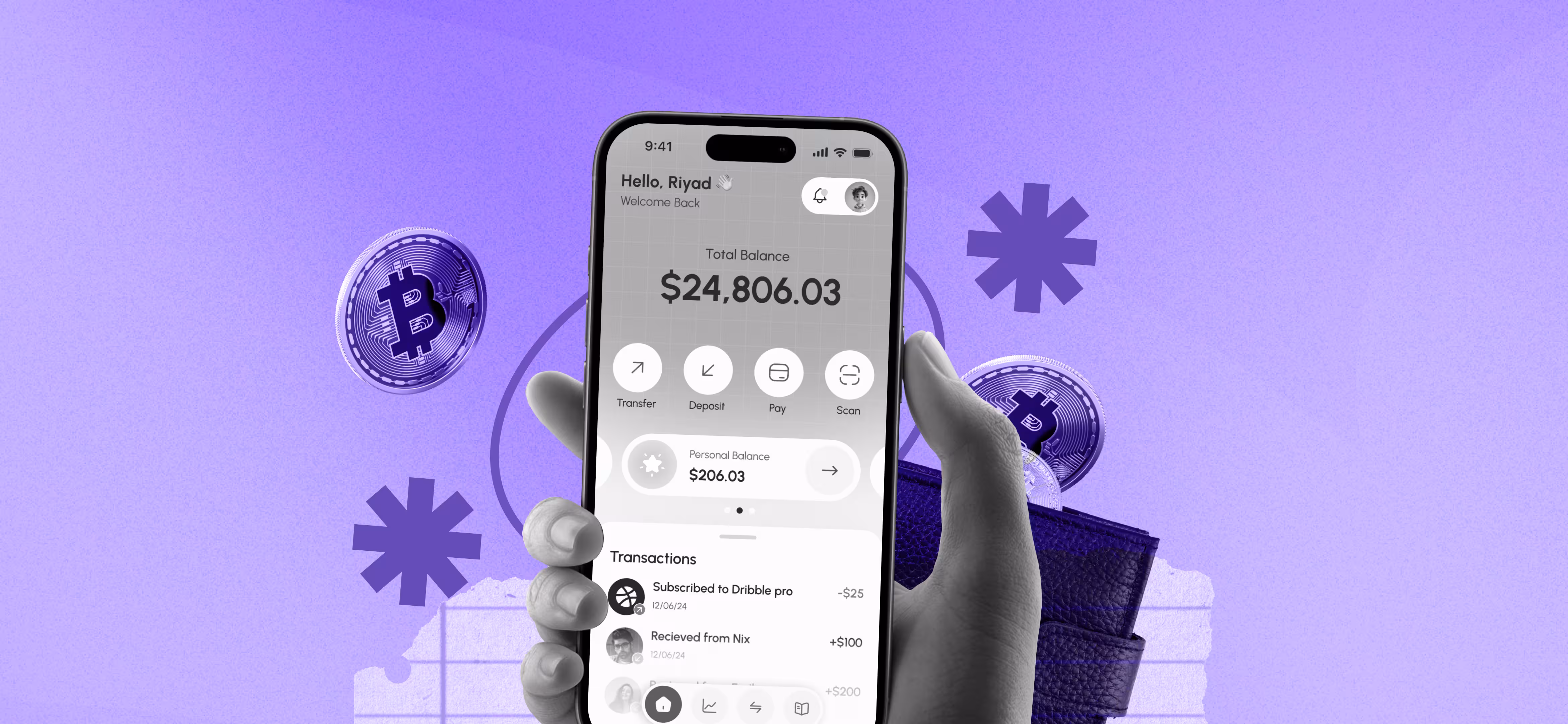
Home and menu screens
Home screen is a component that is important in any application. With mobile apps, it is the primary screen where users engage with the majority of choices of the application. The home screens are developed based on the nature of the product and its intended use even though there are some major common elements between product types. First, the search field or the search button is typically placed in the main screen so that the visitor could easily find the content required. Moreover, given that the home screen forms a starting point of the user experience, it usually consists of navigation items that allow entry to the different content areas.
Log-in and profile screens
Currently numerous applications provide customers with the opportunity to create their own account, and this is the reason why every developer should be familiar with the log-in and profile pages. The minimum and clear screens of the log in screen should be displayed in a way that users can effortlessly use the application. The user typically has two fields where his/her name and password are inputted and the confirmation button. At least there must be the sign-up option, in case people are using the app the first time.
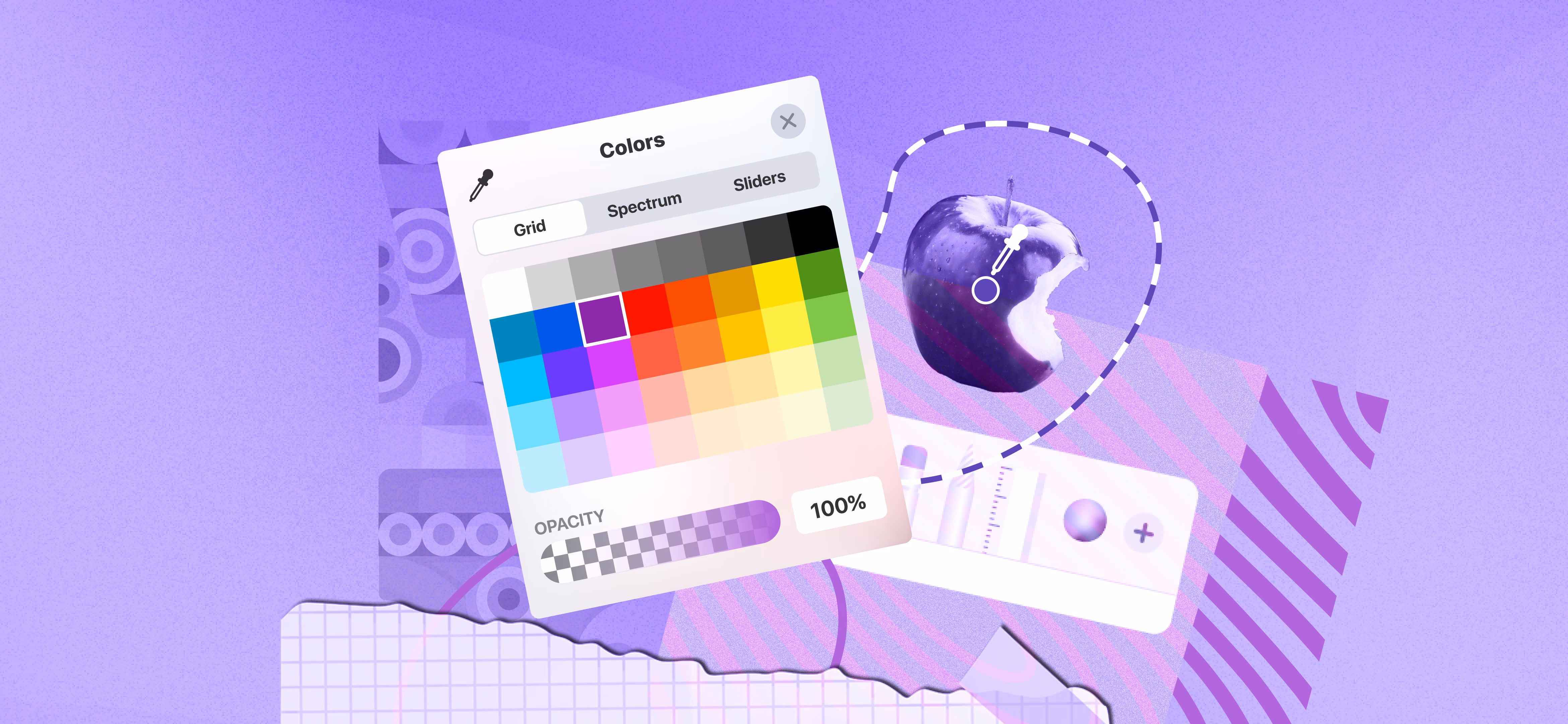
Stats screen
Most applications have statistics of activities by users. The larger the amount of data it gives, the greater the difficulties one might encounter when preparing a mobile design of a stats screen. Designers should ensure that all the most important information can be viewed on the screen despite the fact that it must be clear and usable. The stats screen can appear smooth and clean on a mobile application using graph curves, scales, and original icons. In addition, the use of stats screens would need different typography such that the user could easily view the information.
Calendar
Users have personal calendar delivered by event apps, to-do list apps, and so numerous others. The calendar achieves some functions based on the nature of the application like schedule or remindings. The design must be in line with the atmosphere and purpose of the mobile application.
E-commerce Screens
Catalog screen
The primary goal of every e-commerce initiative will be to sell the products. The impact of visual presentation on the choice of the users is enormous. A catalog refers to a list of items that the firm sells. The role of a designer is to design a catalog which will appeal to users and make them purchase a product. Mobile apps have the ability to make the list of the products similar to most of the e-commerce websites where the products are arranged in catenas and can be accessed through vertical scroll. The settlement of the number of products in a row depends on the width of the screen.
Product card screen
This is the screen that is used by individuals that prefer to know what they actually purchase. Product card represents the most important information about the goods that would assist users to determine whether they require the product or not. The designers emphasize the image of the product and place it in the central part of the screen. The description information is typically positioned below. The designers can classify data into categories like size, material among others so that a user can quickly locate the information that they require.
Check out screen
A significant number of purchases are now carried out through smartphones and therefore, the companies are aiming to make the mobile shopping experience as convenient as never before. Checkout process is the last step that the users undertake prior to their purchasing the product. The mission of designers is to ensure that people are comfortable, as people make this move. The first and one of the most vital aspects of the checkout screen is a form in which a buyer enters some personal information including a name and number of the credit card. The information required will depend on the resource a user makes a purchase. Moreover, people should be informed that their personal data is safe, and that is why the designers must assure users that their data is safe through visual characteristics. It may be both callouts in a copy and certain icons of the famous brands who gave their consent or perhaps even certain certificate signs in case there are such.
Social Screens
Feed
Individuals tend to use different social network applications to communicate and keep track of the news and updates in the surroundings. Feed is an ever-growing list of news and other information that the users are interested in. The practice demonstrates that mobile users like to scan fast along the feed, the rationale why they have to have a simple uncomplicated design that will not overload with visual content. The news may be given one after the other through a scroll. In order to make the navigation more intuitive the following piece of news ought to be partly displayed.
Contacts
Contact list has long been developing. Starting with paper notes to the various digital versions it has been transforming into visual forms still retains only one purpose, which is saving important information about friends and other close individuals. Mobile contact screen will give a list of contact data in the order of the name alphabetically. All the contacts must be clickable and redirect to various detailed information that may consist of the phone number, email, and, in some cases, contacts on Skype, Messenger, etc. In addition, contact details are provided together with a small picture of the face and thus simplifies the search process.
Music Screens
Playlist
Music fans prefer to make their own playlist in every occasion. Clearly, any music application must also offer its users such a feature. The appearance of playlist screen is similar to other apps: it is a list of songs displaying the name of the song, the singer or a band, and the duration of the soundtrack. In addition, the designers have an opportunity to include a small picture of the album this track is a part of. Where a song has no image there still must be an icon such as a music note.
Player
Through the player, people are able to control what they listen to and the mode in which they listen. It has a switch button, a stop/start button, which is easily identifiable and can be used to switch, stop and start a track. This set normally occupies the centre of bottom part of the screen. The image attached normally occupies the large portion of the screen. Moreover, in other cases, instead of a picture, most of the designers use music visualizer as the main element of the screen. Visualizer can be regarded as an excellent chance to unveil imagination and creativity that is undoubtedly motivating to designers.
Wrapping Up:
Today, there are numerous mobile applications emerging, and thus they present novel screens to fresh needs that users are introducing. This challenge should be prepared to be taken by designers and innovations should always be followed. Get inspired!

Read our latest blogs and resources

Reach Out Anytime Connect with Our Team
.svg)


