
.svg)
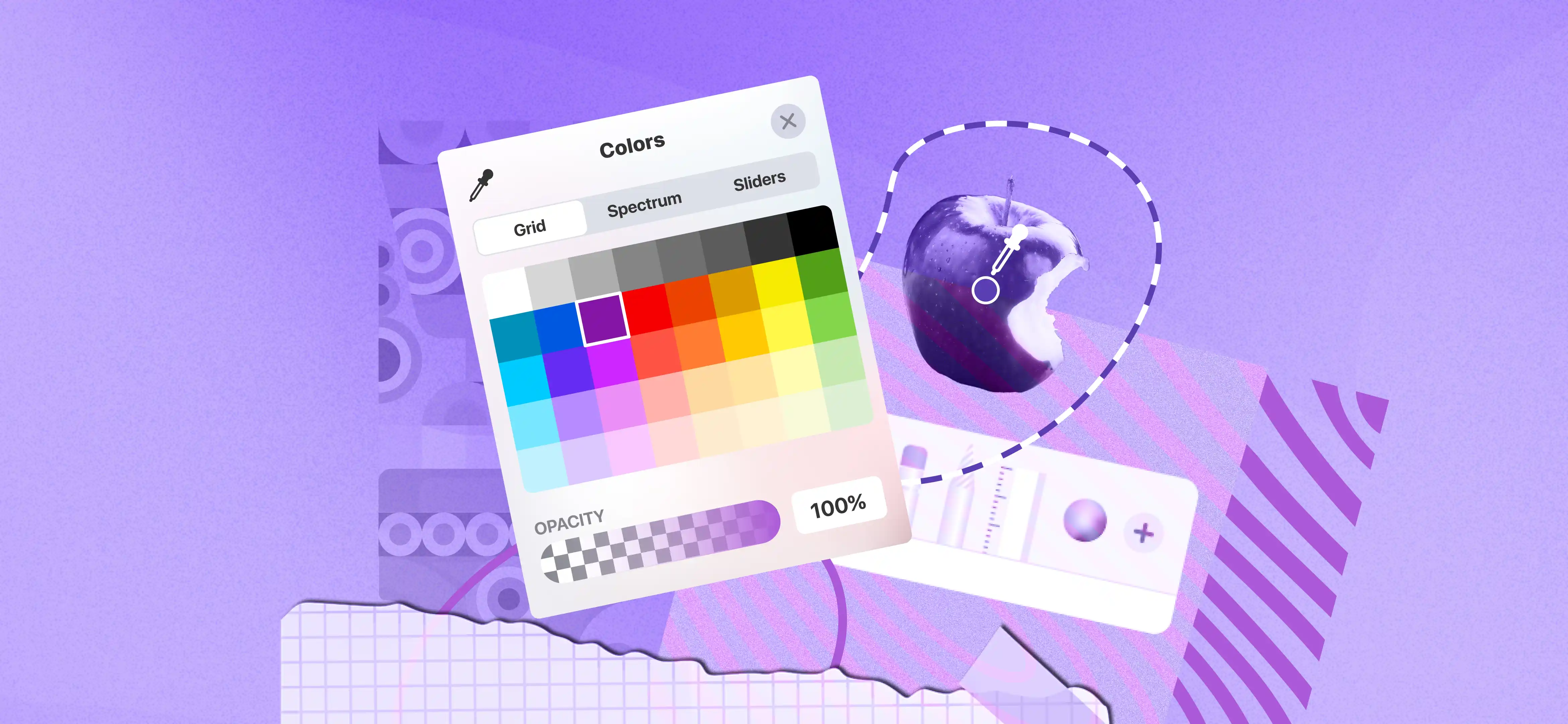


Most Popular Colors in the World
Have you noticed that every brand uses a different color? From the bright gradient of Instagram to the bold yellow of Snapchat, these colors are chosen for a reason. They are not random.
Color changes how people see your business. It creates feelings, builds trust, and reminds people of past experiences. Even before someone reads about your company, color already gives them an impression. Because light and environment affect how we see colors, choosing the right one is very important.
That’s why picking the right brand colors matters. The right colors help your business stand out and look professional. With the right branding design services, you can choose colors that match your message and attract the right customers.
In this article, we will explore which colors people prefer and why companies choose certain colors for their brands. Let’s begin.
Which Color Is Best For The World?
Research by YouGov across ten nations shows blue ranks as the worldwide favourite color. Research from every survey tells us blue ranks first among all preferred colors.
The results differ depending on specific population groups. British people stand first among all nations in preferring blue as their preferred hue. After the UK blue stands strongest as a preferred color in Germany followed by America Australia and China.
Men demonstrate a stronger affinity for blue than women do. Results from America show 40% of men choose blue as their number one color but just 24% of women from the same location pick blue. Besides blue these four colors are top choices globally including green, red, purple and yellow.
What Is The Meaning Of Each Color?
You can choose the perfect option when you understand the distinct meaning of colors. Those are given below:
Blue
Serious businesses like Facebook select blue because it generates trust and relaxation within customers. Tech organizations find blue builds trust. In healthcare environments blue establishes a sense of peace and security for patients in a secure environment.
Green
Green stands for ecological preservation and represents the normal development of nature. Brands that focus on restoring nature and environmental health choose green because it represents tree new starts. Businesses that handle financial matters regularly use the color green to show their affiliation with wealth.
Red
Red details all the liveliness and requires immediate answers. People detect red messages instantly and react fast which makes this color ideal for advertisements and critical notices. The color activates powerful emotions including enthusiasm and need while permitting strong promotional campaigns. Studies show love and romance linked to the color red. Advertisers apply red textures to their visual content because red conveys love through marketing.
Yellow
This vibrant color acts like natural sunlight by creating happiness and good moods. Brands that target creative audiences will find yellow helpful because the color represents their ability to think and create. Using yellow widely in design and branding requires restraint since it creates strong intensity but too much yellow triggers feelings of pressure.
Orange
When combined yellow and red the color orange shows both spirits bringing enthusiasm and creativity together. The color orange brings energy and adventure to brands while helping them surpass their competitors. Food eateries both casual and upscale choose orange because it enhances appetite. Juice shops use orange as their primary brand color since it shows up regularly here.
Purple
Purple signals prestigious status and spiritual power helping high-end brand organizations stand out from the competition. Both lamborghini and bugatti use purple for their luxurious vehicle extras. Brands that want to create intricate and captivating designs should use purple which adds depth and creates a sense of mystery. The purple color works well for companies in fashion, beauty and wellness markets.
What Is The Importance Of Colour Theory In Branding?
Every professional in the UI/UX field understands colors hold significant importance. Design quality depends entirely on expertly picking the right colors. Brands require accurate color selection to properly define their market position. Keep in mind that your audience will only make purchasing decisions based on color once they trust your brand first.
Selecting appropriate color combinations matters more than picking a single shade. Digital product designers need to examine brand messaging combined with audience details and market trends to find the perfect color options.
What Is The Psychology Of Color Preference?
How people make decisions depends on the way colors affect them emotionally. We will examine different color effects and describe their psychological effects.
Cultural Backgrounds
Color meanings differ in different cultural settings where white stands for purity in Western societies but represents mourning in Eastern traditions. Based on research designers adapt their color choices to fit with their customers' cultural expectations and preferences.
Triggers-Specific Emotional Reactions
Customers feel peace and trust when they see blue which helps businesses show their dependable and professional side. Red and orange warm hues help marketers generate fast reactions by stirring excitement and impatience in their materials.
Brand Decisions and Psychological Effects
Bold red stands powerfully for Coca-Cola as it drives its dynamic brand persona.
Starbucks fights for the planet through its green branding which matches how its audience wants to live sustainably.
People Of Different Genders Display Specific Color Preferences
Scientists have found that male consumers favour intense colorful shades, unlike females who normally select delicate subtle color schemes. Product developers need to factor gender diversity into their designs so all customers find their materials appealing but stay true to their brand identity.
The Way Colors Impact to Take Decisions
Different colors have a substantial impact on what customers decide to buy both online and offline. Designers can build better user experiences by understanding the impact of specific hues on viewers' thinking and actions.
Colors Capture Attention
Using bright colors like red and orange helps us get viewers' attention fast so they can see our call-to-action or sales messages. Bright colors bring user curiosity and push them to investigate more which strengthens their connection to the presented material.
Brand Identity And Visibility Among Their Customers
When you stick with your brand colors people recognize your brand better and identify it with their first look. Colors act like signals for brand identity that link directly to how consumers think about and stand by their preferred companies.
Choosing specific emotional colors helps brands deliver intended reactions during product experiences. Colors produce feelings that impact our buying choices. The use of yellow and orange emits warm positive energy while blue and green produce relaxed and trustworthy feelings. With thoughtfully chosen color selections designers create deep user engagement which influences brand behaviors and customer actions.
Call-to-Action Effectiveness
The specific color of your call-to-action button greatly affects how well it leads users to take desired actions. The design team needs to find visual elements that people will notice first with these specific buttons. A call-to-action stands out better when designers use contrasting colors rather than design elements because this interest boost leads users to take action more often.
Mood Enhancement and User Experience
Beyond appearance colors help shape emotions and define space ambiance. When websites need to establish trust and relaxation they should use calming blue color schemes like medical practice or financial institutions. Designers who factor in color effects on emotions help create environments that make users think and choose better.
Tips that Designers Can Follow
1. Consistently try with colors until found your preferred outcome
Experimentation is key to uncovering unique and impactful color combinations. Use tools like Adobe Color, Coolors, or Canva's color palette generator to explore variations. Gradients, opacity tweaks, and layering colors can also bring depth and dimension to your designs. Remember that finding the perfect color scheme is often a process, not a one-off decision.
2. Try to align brand voice and audience’s choice
Colors communicate emotions and messages, so it’s essential to match them with the brand's identity and target audience. For example, a luxury brand may benefit from muted tones like black, gold, or silver, while a children’s app might favor bright, playful hues like yellow and red.
3. Bring small changes in colors for A/B testing
Small color adjustments can have a significant impact on user behavior. For example, changing the hue or brightness of a CTA button might lead to higher click-through rates. Try A/B testing to compare the performance of different color variations. Tools like Optimizely or Google Optimize help you to implement and analyse these tests effectively.
4. While adding bold colors, be cautious about the outcomes
Bold colors can grab attention, but overusing them can lead to visual fatigue or make the design look overwhelming. Use bold colors strategically for elements like CTAs, headlines, or highlights while balancing them with neutral tones to maintain harmony. Testing the design under different lighting conditions and on various devices can also ensure it remains visually appealing.
5. Get feedback from real-world users for better understanding
Real user testing gives essential updates about how users see and interact with the color choices of your design. User testing sessions, surveys, or focus groups can help you understand whether your colors evoke the desired emotions and align with user preferences. Pay attention to their feedback on accessibility, as colors may look different to users with color vision deficiencies.
6. Don’t stick to a particular color theory when you are not getting results
While color theories like complementary, analogous, or triadic schemes provide a solid foundation, they shouldn’t limit creativity. If traditional approaches aren’t yielding the desired results, think outside the box. Experiment with unconventional pairings, gradient overlays, or even monochromatic designs to achieve unique outcomes.
Bottom Line:
Color is more than just a visual choice — it shapes perception, builds emotion, and influences decisions worldwide. Every successful brand understands the psychological impact of color and uses it strategically to communicate its identity. To stand out, you must first discover what makes your brand unique, then choose colors that align with your message, values, and audience expectations. Random color selections can weaken your brand presence and reduce performance by creating confusion instead of clarity.
Partnering with experts like Focotik ensures your brand colors are thoughtfully crafted to build trust, strengthen recognition, and inspire confidence. With a strategic branding approach, Focotik helps transform your visual identity into a powerful tool that engages visitors and encourages them to confidently choose your services.

Read our latest blogs and resources

.avif)
Reach Out Anytime Connect with Our Team
.svg)


