What Is A Modal In Web Design? Tips You Must Know!
Sometimes when you are visiting a particular website, other new windows are opened on your screen of their own accord. In web design, this opens up a smaller independent window known as a modal window. Perhaps you were glad to come across this popup, or you might have been perplexed when it appeared suddenly. Well, this window got everyone’s attention no matter how they reacted to it initially. Some see usefulness in the fact that they can swiftly draw attention to something important, others view them as an intrusion regarding the user. They may afford to provide coupons and they could suggest the consumer subscribe to a certain newsletter or simply inform. In fact, after a few clicks and interactions, these elements vanish like magic.
What Is A Modal In Web Design?
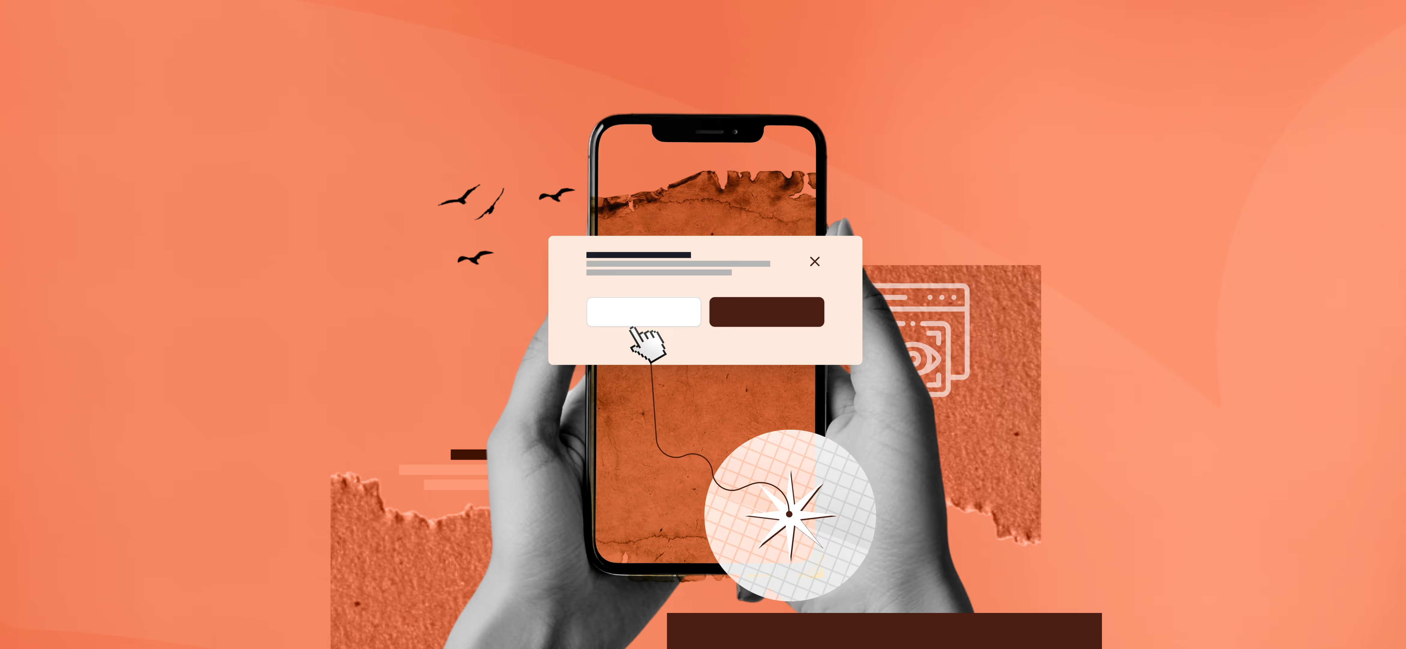
As we mentioned before, a modal is a small window which appears right on top of the content you are only observing. These elements can fulfil various tasks. For instance, to approve actions, to provide the visitors with offers, with the opportunity to register and receive additional information. Modal windows are considered one of the main elements for maintaining users’ attention on the site
Mainly, modal works by freezing the main webpage activity and drawing people’s attention to a single item. This makes them very suitable in use cases where the user needs to concentrate, such as when completing a form or watching a video. That is why, if you do not want any mistakes at the beginning, you should turn to web design services. Though modals might look like plain UI/UX pieces of work, experts can leverage them to generate clicks and conversions.
Modal Vs Pop-up
Modals and pop-ups are thought to be the same thing or a subset of the other, and, in fact, they are two quite distinct things. Pop-ups are additional windows which appear over the browser. They should include timers; they can fade away after a few seconds if the user does not touch them.
It is also vital to embrace that while there are several types, some pop-ups can be blocked by certain ad blockers. At the same time, pop-ups within the system are considered valuable; they enhance the organization of work and notify the user of the results of the performed operations.
Modals are in the same browser window as the content, though the modals overlay the content and reduce its transparency. For instance, while browsing, you might be asked to confirm that you agree to the terms and conditions at Google, or you are being notified about the changes in the new features section. Such windows are used by Spotify to onboard new users, it directs them to the sign-up process without the need to move to another page. Similarly, to make people fill in the profile section or endorse connections, LinkedIn uses modals.
Types Of Modals In Web Design
Different categories of modals exist within web design frameworks. Web modals can be grouped into multiple categories based on their desired function. Whether they deliver information received from the user specify the user’s information, show the image to the user or give information within the page.
Informational Modals
Informational modals look like a window. Inside a window of a page ensure the user is directed to a piece of information which can be an alert, update or a message. If the use of the modal is optional the user can simply click somewhere outside the modal to close it. Some modals, on the other hand, will prompt the visitor to enter some data in order to proceed further. For instance, an e-mail address, a name, country of residence etc. That’s how Adidas uses a modal to make the users fill in the form and subscribe to receive further information. Explaining the advantages of joining a club in a non-complicated manner, Adidas offers its visitors to join their club.
Lightbox Modals
This is a modern modal that uses Lightbox to enlarge and display multimedia content on the webpage. It is primarily a tool to advertise a product or service, highlighting some or all of its characteristics. Lightbox modals minimize the accessibility of other elements of the page during the modal’s activation, using a dark or blurred overlay on inactive areas. The modal can close through a user interaction either clicking the 'x' button or selecting any area outside the modal boundary.
Inline Modals
Another type of the modal is inline modal, which appears on the same line as the page. They do not cover the entire page. They are very useful for passing extra information that can be time-consuming to navigate on being redirected to a new page. You can observe how Evlo Fitness a brand that offers online fitness workouts to its customers, use in-line modals to offer the visitors answers to some of the asked questions.
Benefits Of Website Modal
Even when modals are small and look fairly innocent, they can produce miracles. It is all about increasing engagement and enhancing the overall experience of the users of the platform. So, let’s get into the details of how these subtle tools can give your website a more sophisticated look.
Focused User Attention
Since it is possible to put a lot of information on the page, using modal windows is a good decision. They limit the quantity of information with which users have to engage simultaneously and help to prioritize elements. It may be as simple as signing up for a newsletter or confirming the purchase — these elements result in certain actions.
Improved Usability
Modals make it easy for users to interact with your website due to the clear and concise meaning of the word. When users need to enter some information into a form, read some information, or accomplish a simple task, modals will come in handy as everything the user needs is provided in a separate window. Well, this translates to less time in scrolling and seeking and more time in implementing the goals and objectives.
Effective Use Of Space
Adding to it, modal windows can turn even the smallest screen into real estate. Rather than having the main list of the information on the homepage, they enable you to add extra items neatly and concisely. This means that primary data is less cluttered and essential messages or calls to action are made prominent at the center.
When Is A Modal Window Used In Web Design?
Now that we have presented the uses of modal windows, it is essential to identify when to use modal windows in web design. Every purpose is used in a different set of options, making the modals convenient for any circumstance. Well, let us have a look at when which modals are most beneficial to web designs.
Alerts And Confirmations
One of the main classifications of modals is alerts and confirmations that notify users and guarantee their proper actions. They provide critical information messages, alerts, or messages about errors you may not wish to miss. For example, when one is about to remove a file, a dialogue box covering the whole screen shall pop up asking whether you are sure you want to delete the file.
Registration And Feedback Forms
Registration and feedback forms are also used to gather user feedback. It is usually accompanied by more coupon codes, further discounts, and numerous other benefits.
For instance, when you click on the audit services page on the website, a registration modal asks you to sign up for a free audit. Users experience simplified signing up through one continuous process without needing to switch between multiple pages.
Media Displays
The modals are amazing for presenting different types of media content. They enhance usability by offering a rich way of visualizing information to the users. For instance, if you are using an online portfolio or a gallery, clicking on a thumbnail expands it into a modal window with a larger picture or a video, descriptions and more information.
Product Details
Product detail modals are very helpful when users need information about a particular product at a glance and briefly. For example, in online shops, modals might open where customers can find detailed information about the product, images, opinions, and costs.
When you read a product title, you could hover and be taken to another window with images, colours, and reviews. It makes it possible to make decisions about items without detaching you from the shopping process.
Multi-step Processes
An example of when to use multi-step process modals is in an online store when there is a step-by-step process of buying a particular product. For instance, after choosing a product the modal can guide the people on size and colour preference, add to cart, input shipment details, and pay. This way, it is much easier to guide the visitors’ attention and guarantee that they will follow the required actions without problems.
Notifications And Messages
With modals there is no way that users can ignore important notifications and messages that need to be relayed to them. These windows make sure there is no way a visitor can miss and fail to acknowledge the information. For instance, if there is some update or alerting notification, a modal can immediately Pop up and pass the message.
On the same note, we also employ the use of modals on our website to remind users they have inputted the wrong data. Then a window pops up saying that there was an error encountered and that the visitors need to try again. People have an instant response to what they are doing and can get back to browsing immediately.
How To Use Modals In Web Design
If a modal is used on a website, a visitor will be able to distinguish between a useful modal from a useless one or a sub-par modal design. The below 8 processes will help you to make your modal more effective:
1. Communicate With Your Audience
Modals are designed to disrupt communication and learning interactions. They are usually discrete from the browsing experience and always interrupt focus with their parent window. This is costly for the end user and as such modals should always be helpful to the user. If not, users will lose sight of what they intended to achieve and will just get annoyed. You can use forms as well. Focusing on its functionality, forms should only be used to collect the necessary data or at least enhance visitors’ experience on your website.
2. Deactivate All Background Elements
To apply the focus on the modal, it is necessary to exclude all the interaction and visibility of the background areas behind the child window. For instance:
Visual Effects: Most or all of the parent elements are made blurry and/or dark using modals. This makes it look like the modal window is hovering above the rest of the content and some drop shadow around the modal can do this too.
Disabling Functionality: Be careful not to allow any item on the page, which is located beyond the modal box, to be clickable or focusable through the keyboard, and even deactivating scrolling may be a good idea. Any extra features from the parent interface will generate confusion for users.
Another important note: Since a modal makes all other content of the page non-interactive until the modal is closed, all the information that the users are required to input /see to complete the modal has to fit into the modals window. Users should not have to jump to parent content to deal with the modal. Any operation that entails such context switching is better served by a modeless interface.
3. Write Clear Instructions
When the user is taken to the modal screen, it may take them some time to understand why they are there, so to overcome this, try to make all the text as concise as possible. Every modal should have a title attribute which describes what the modal is for or what is expected from the user. The text on buttons along with all action prompts needs to stay direct and simple to understand.
4. Add Closing Window Button
In every good modal window, one action is mandatory – the ability to close the window. According to the convention, when a user presses the escape key, or ‘X’ symbol or word ‘Close’ at the top right or left of the modal window, it should close spontaneously. One can choose to close it when the user clicks outside the modal window or to put a ‘Cancel’ button inside the modal instead of ‘Continue’.
5. Position Your Modal Window Correctly
Each modal should be simply a layer on top of its parent window. This occurs particularly when the size of the modal is too large, users may begin to perceive the modal as completely separate from a regular web page. Like in the case when it is too small the modal may be considered as an ad. Hard and fixed rules are to choose a modal window not to exceed 50% width and approximately the same for the height of the given modal. These figures can change depending on what exactly is placed into the modal.
6. Engage And Dismiss The Modal With A Sign
Add a transition to make it smooth to open a new kid window from the parent window. The traditional method of fading the background content out for a second and then fading the modal window. Any other transition (for example, a sliding one) might seem too intrusive to some — a fade-out of the Starry video modal, for instance, happens quickly, yet smoothly.
7. Design Your Modals For Accessibility
The ESC key should lead to the closing of the window and the tab and enter key buttons can be used to make a selection. All control elements, which are outside the modal mustn’t be activated with a keyboard when the modal is active. I also realized that the modal window must stand out from the background page through contrasting colors. Changing into and out of the modal should be neat and simple. Any image, video, or any other media element in the course should have an ‘alt’ text.
8. Make Responsive Modal Windows
No need to mention that the screen sizes of a mobile device are different than a desktop. There should be some touch-friendly features in case the project is tailored for use on mobile devices. Accordingly, Buttons should be designed in such a way that they can easily be tapped. It should also be noted that the cross should also be located at a place where there is no need to scroll to find it. When embracing all these practices you will ensure that you’ve designed an all-inclusive and satisfying user experience across and within every device.
Wrapping Up:
Seeking the user’s attention is standard, but excessive modal usage can easily annoy and push users away. To prevent this, try using different variations and select the one that would create the desired impact on the target audience you want. I hope by following our above tips you can avoid the implementation of incorrect concepts from the bottom. If you have more queries, let us know in the comment box.

.svg)


