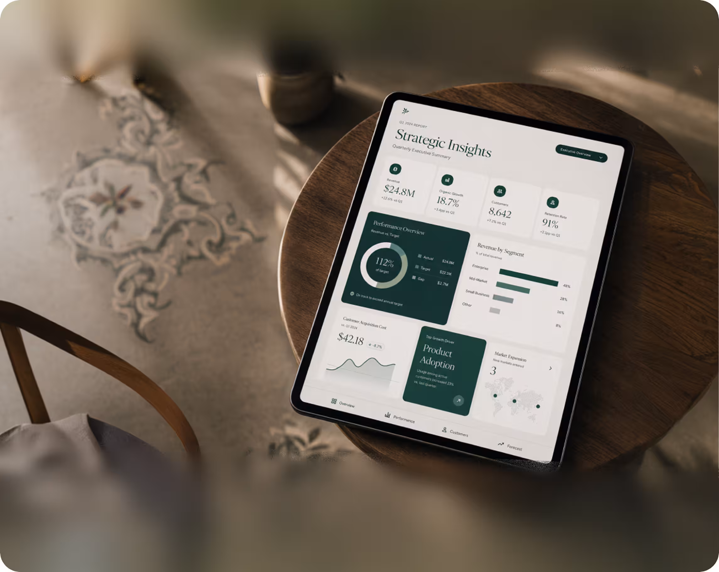
Dashboards that turn data into decisions
We design dashboards actually open every morning for analytics, BI, finance, operations, marketing and healthcare. Information architecture, data visualization and decision-first UX. Trusted by data and product teams across 36+ countries.
Top partners that we worked with.


Most dashboards are slow to answer business questions
Across analytics and BI tools, the average user spends 3+ minutes hunting for the answer to one question clicking through filters, switching tabs, opening Looker, asking the analyst. The dashboard was supposed to prevent that.

That's how long teams typically spend finding the answer to a single business question on a poorly designed dashboard. A well-designed dashboard answers it in under 10 seconds.
The most-asked question goes at the top. Always. Everything else is supporting evidence not a parade of equal-weight charts.
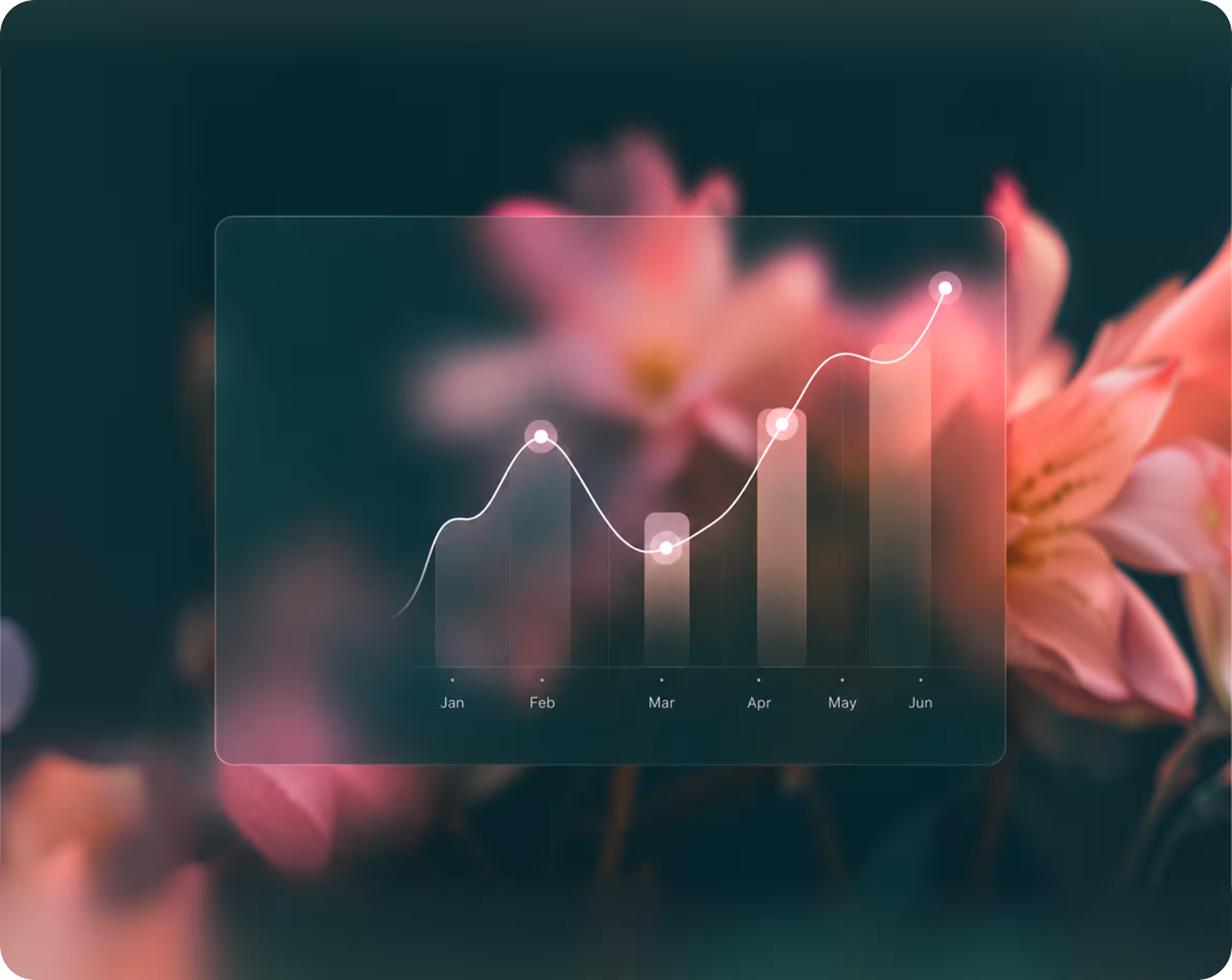
Not every metric needs a line chart. Bars, scorecards, sparklines and tables each answer specific questions picking right halves time-to-insight.
Most dashboards drown in filters no one uses. We design filter sets around the 3–5 questions teams actually ask, not the 30 they could.
of downloaded apps are abandoned within 3 days of install, not because the idea was wrong, but because the experience didn't make the value obvious fast enough.
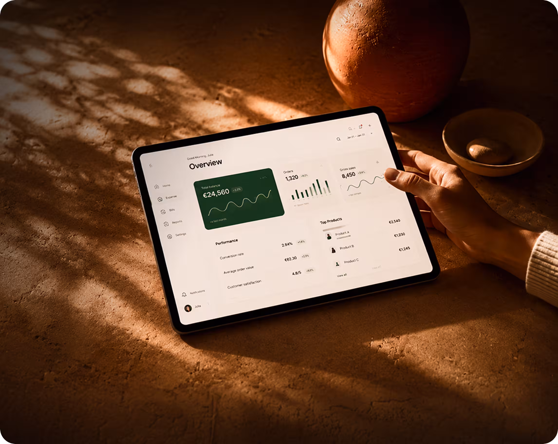
A complete dashboard beyond just pretty charts
Most agencies hand you a hero screen with three vibrant charts. Our studio designs the whole decision system IA, KPIs, drill-downs, filters, comparison views, alerting, exports. The parts that turn data into decisions teams actually make.
Identify the 5–7 key metrics that matter, the questions they answer, and how to quickly access them.
Charts tailored to questions: bars, lines, scorecards, sparklines, heatmaps, and funnels. Clear design for all screen sizes.

Dashboard hierarchy, drill-downs, comparison views, and filters built around real workflows, not just mimicking Looker.
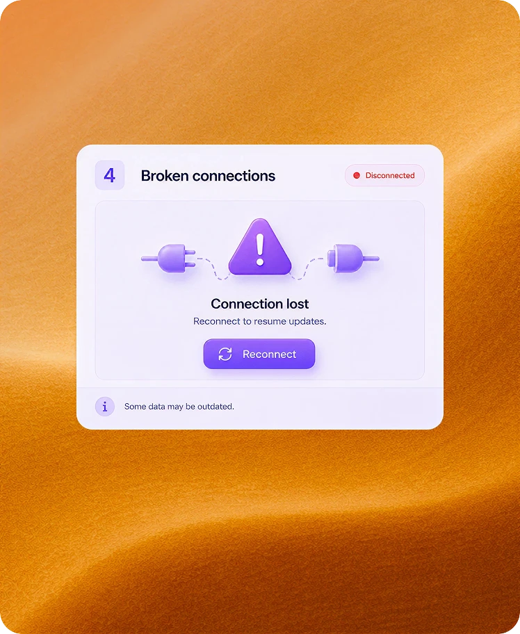
The states often overlooked by agencies: no data, partial data, slow queries, and broken connections. Designed to keep users confident.
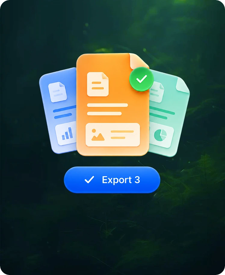
The essential connections: alerts, scheduled reports, CSV exports, and Slack integrations. Dashboards that inspire action.
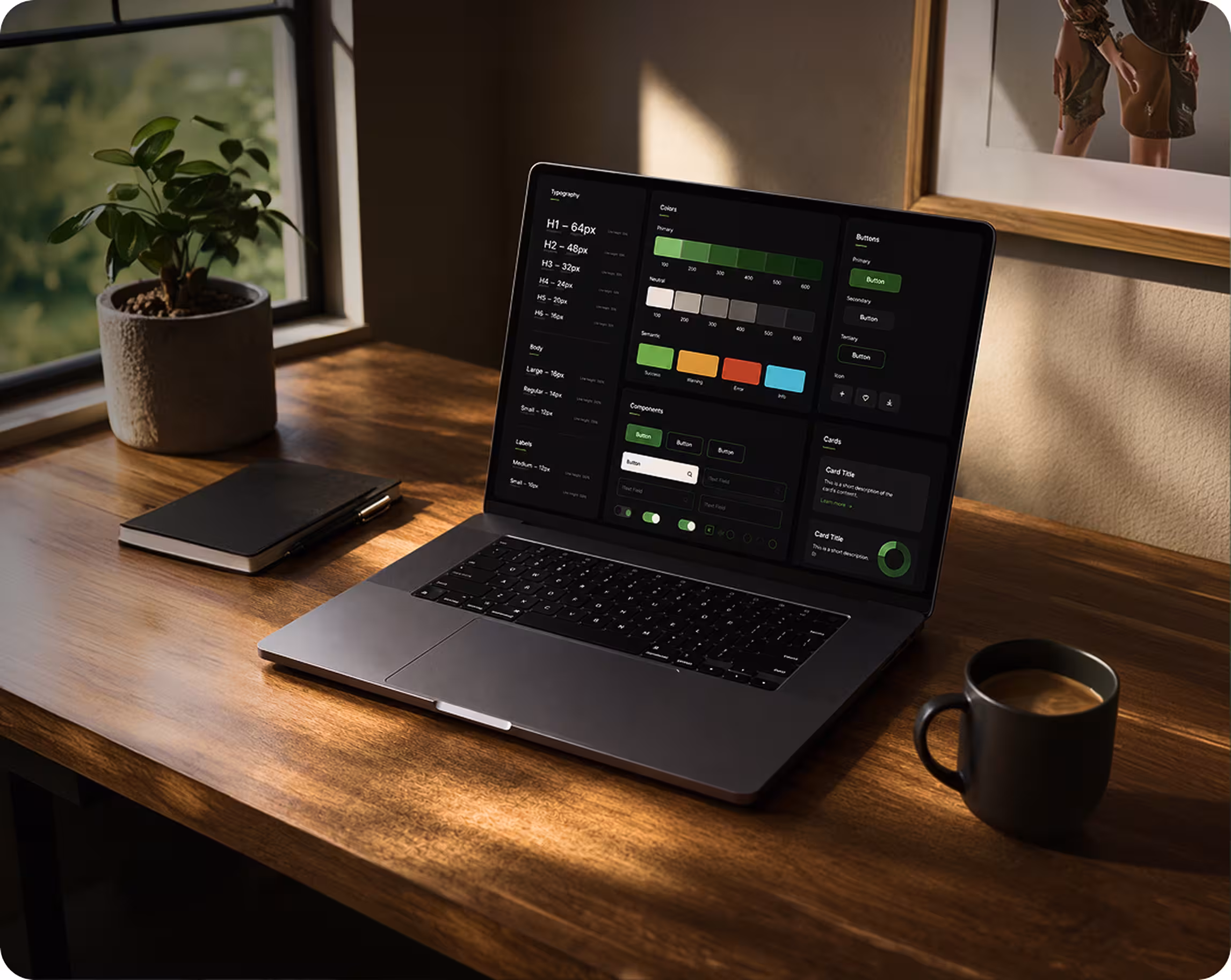
A Figma component library with KPI cards, chart types, filter patterns, and data tables, ready for engineers from day one.
We improve clarity and usability through performance reviews, tests, and continuous updates as teams and goals change.
A dashboard design partner you can trust
Lorem ipsum dolor sit amet, consectetur adipiscing elit. Suspendisse varius enim in eros elementum tristique. Duis cursus, mi quis viverra ornare, eros dolor interdum nulla, ut commodo diam libero vitae erat. Aenean faucibus nibh et justo cursus id rutrum lorem imperdiet. Nunc ut sem vitae risus tristique posuere.
40
%
120
+
3
x
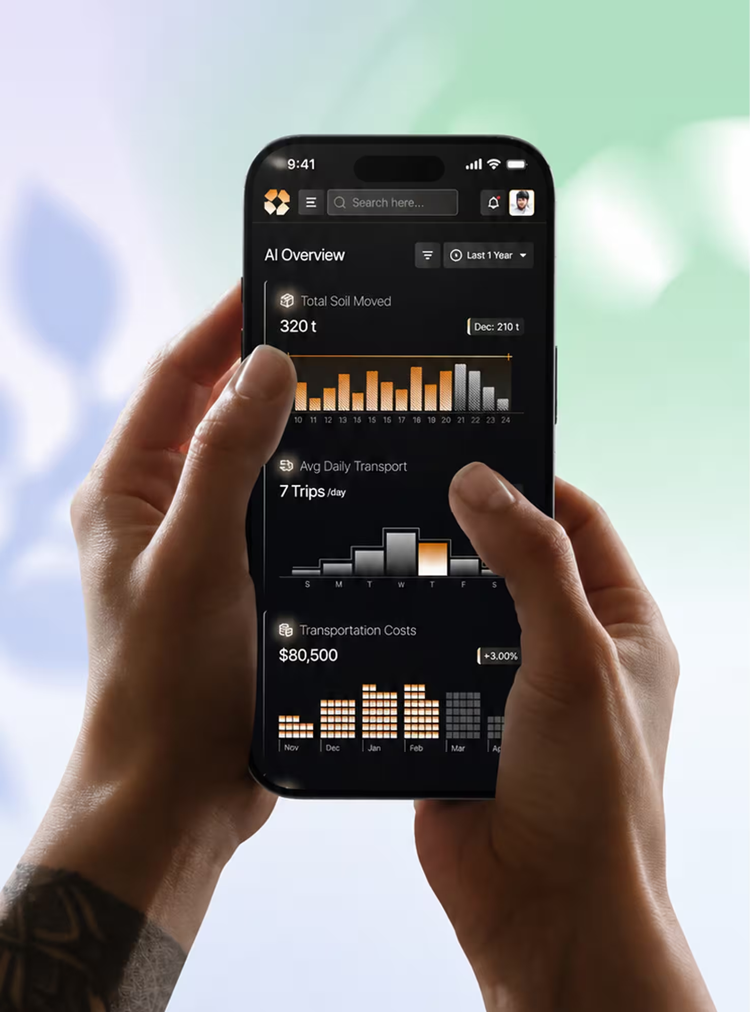
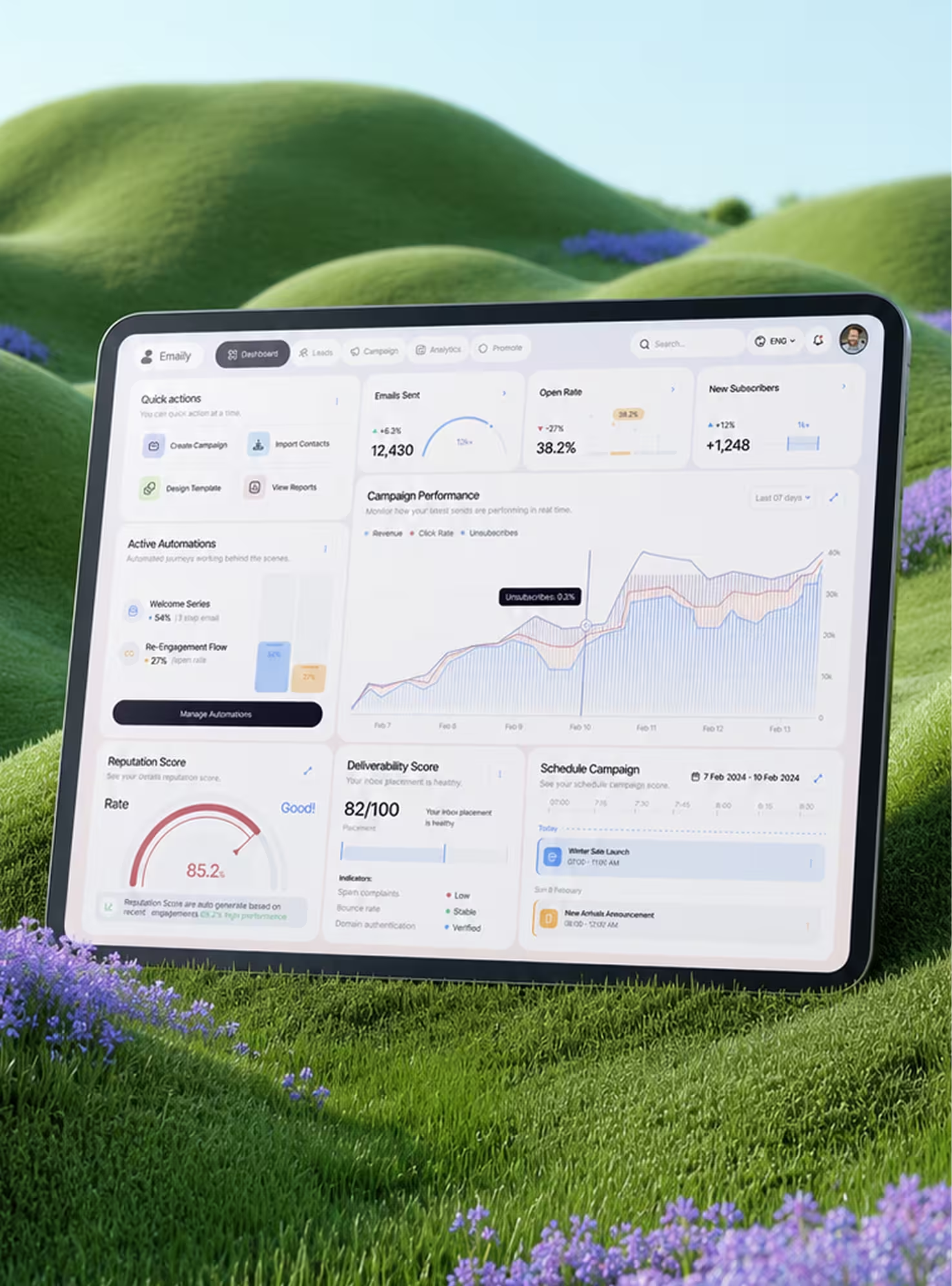
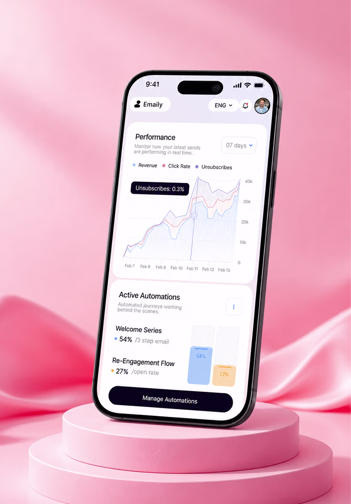
Dashboards in users' hands, not concepts in a portfolio
A few of the dashboards our team has designed end-to-end. Demo placeholders below to be replaced with live case studies.


Five phases, every phase ends with something you can review
No black box. Every phase has a concrete deliverable you can inspect, test, and approve before the next begins. Built various brands refined until great work happens consistently, not occasionally.
We map your users, the decisions they make, and the questions the dashboard has to answer. Most projects shrink the metric list by 40% in this phase alone.
The decision hierarchy which question goes where, which metrics support which decisions, how drill-downs flow, and what the filter set actually is.
Lo-fi wireframes lock layout and chart selection before visuals. Stakeholders sign off here, so we're not arguing about whether it's a bar chart at hi-fi.
Full visual design, light + dark modes, accessibility passes, and a Figma component library KPI cards, chart variants, tables, filters your engineers can build from.
Interactive Figma prototypes, time-to-insight testing on real users, and a structured handoff your engineering team can ship from on day one.
Dashboard across industries, one team that masters them all
From regulated finance dashboards in Dubai to real-time ops platforms in London our studio has shipped across every major dashboard category.
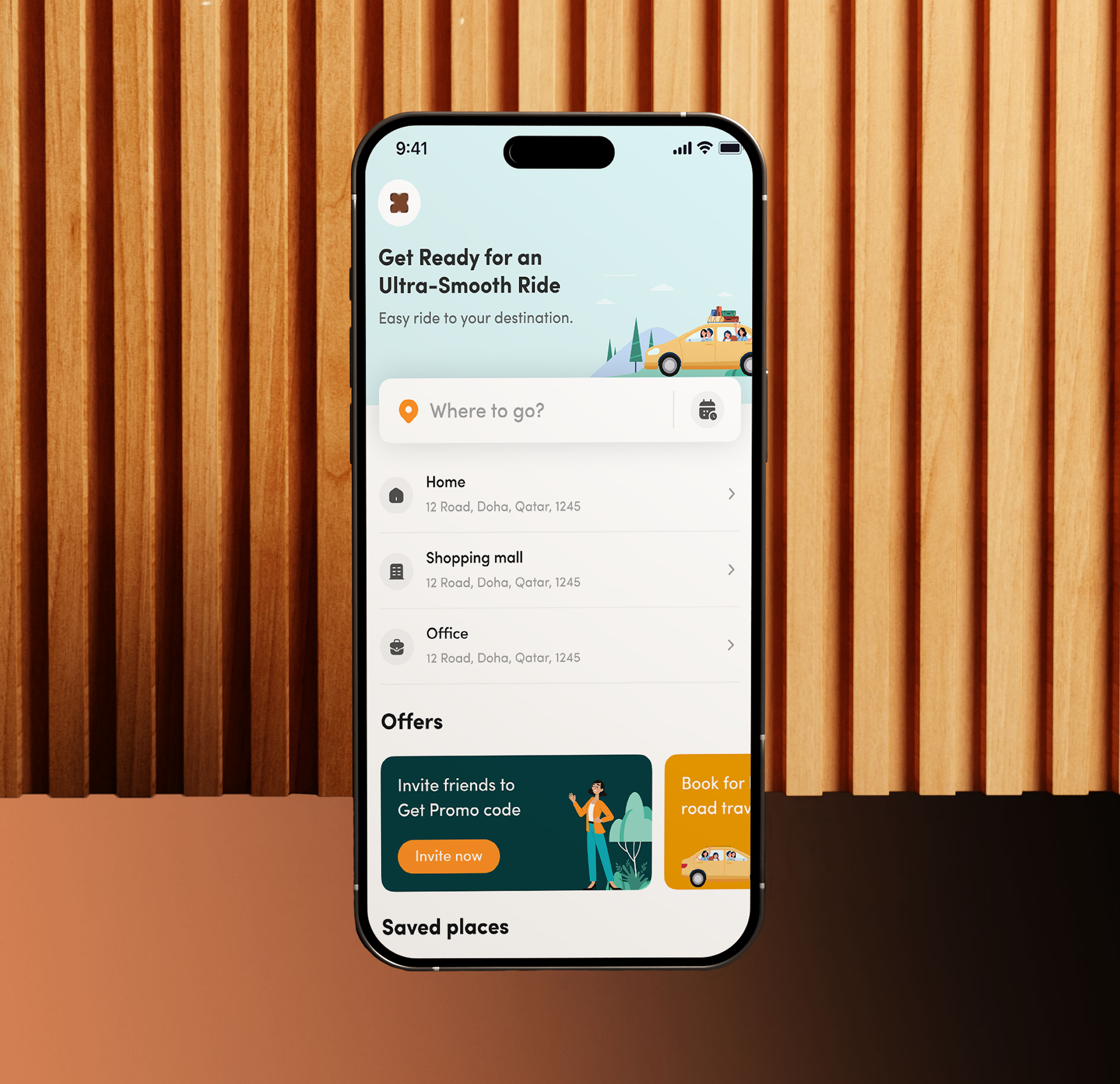
Self-serve BI surfaces, product analytics dashboards, and customer-facing analytics built for non-analysts to find answers without help.
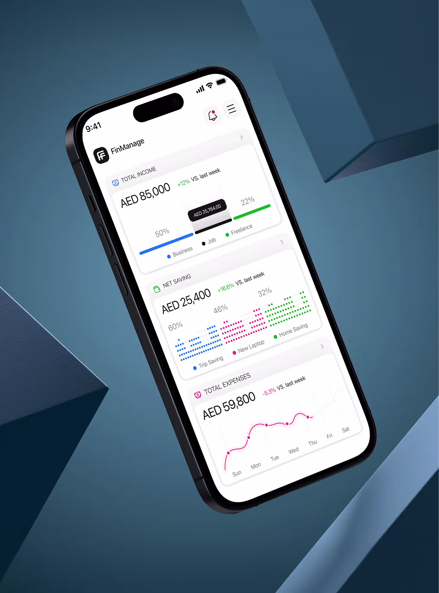
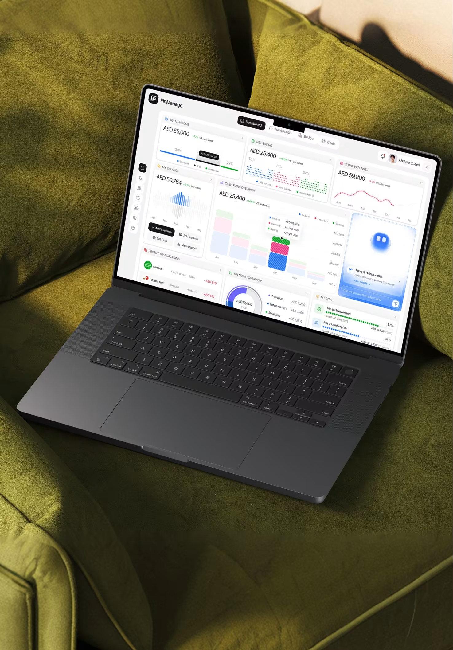
CFO-grade finance dashboards cash, runway, MRR, AR/AP, board metrics designed for accuracy, audit trails, and Monday-morning trust.
Real-time ops surfaces fleet, SLA, fulfillment, supply chain, exception alerting designed around the workflows ops teams actually run.
Funnel, attribution, channel performance, cohort retention dashboards that answer "what should we spend more on" in 10 seconds.
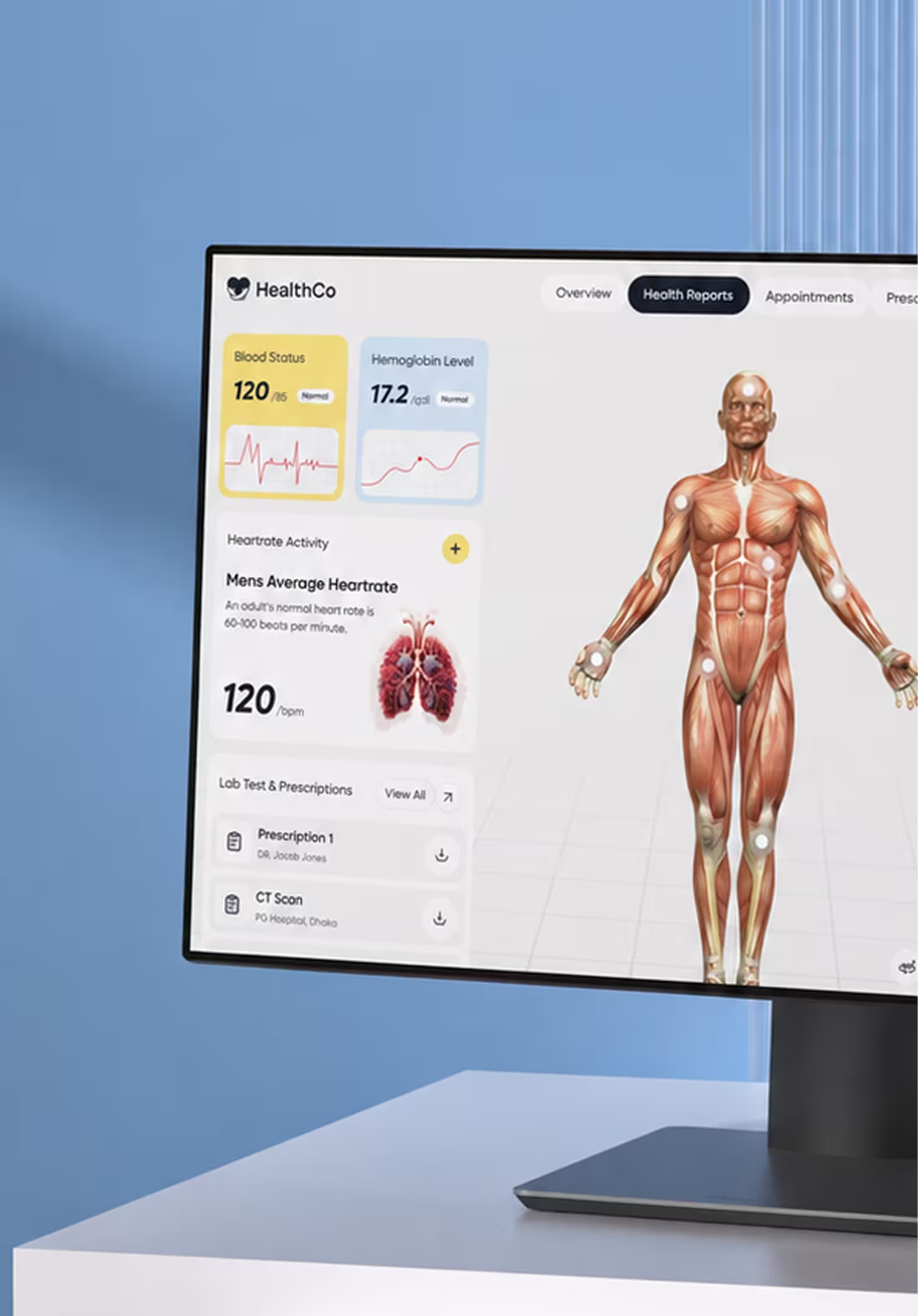
Clinical, patient, and provider dashboards — designed for high-stakes environments where misreading a chart isn't an option.
Internal admin surfaces, back-office ops dashboards, and team-specific decision tools designed for the people who actually run the business.
Your tools, your timeline, every sprint we’re there
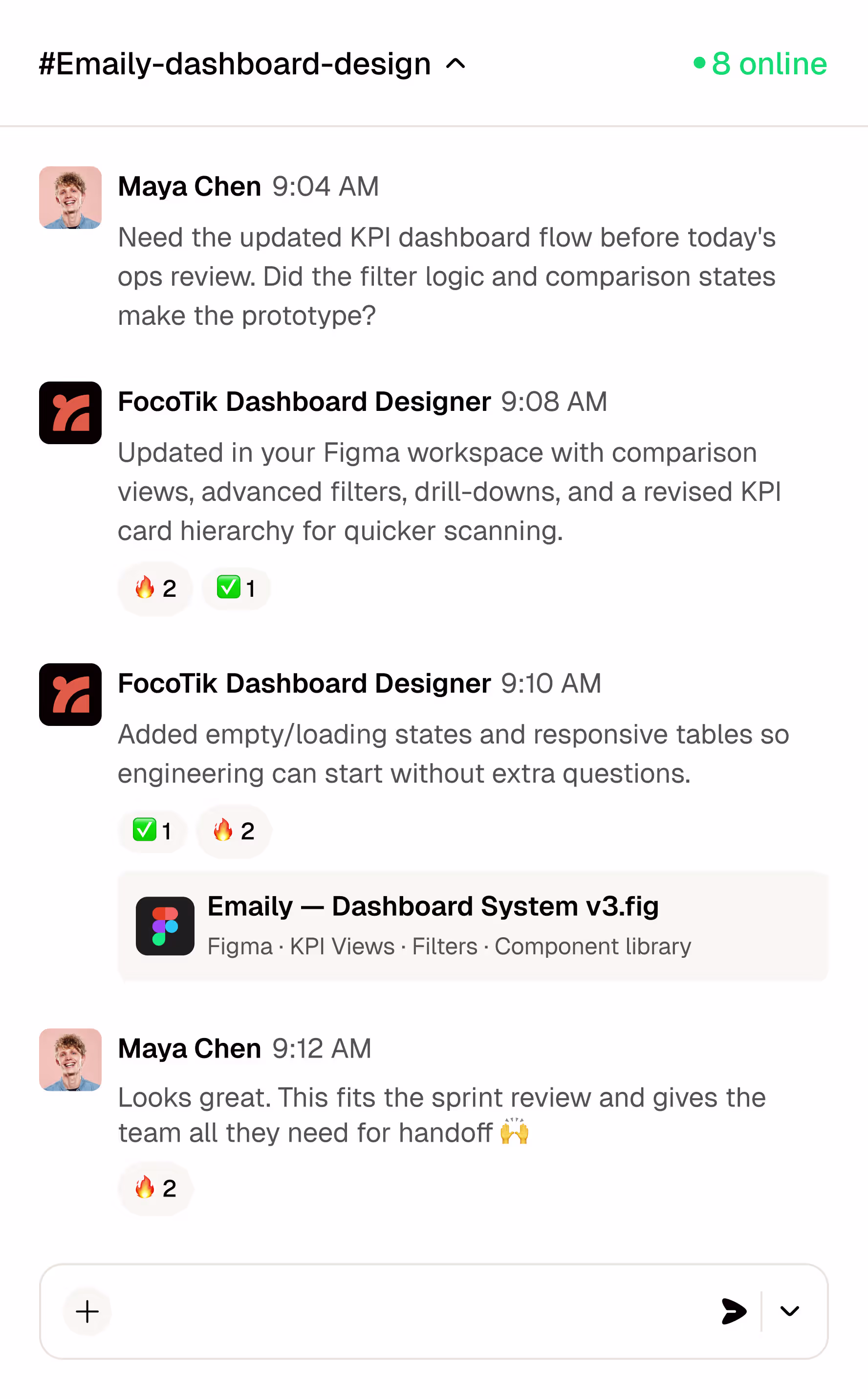
FocoTik works directly inside your existing product workflow instead of creating another layer of process. From Figma collaboration to sprint-based delivery, every update, revision, and handoff happens where your team already operates keeping design aligned with engineering, product, and launch timelines.

Our team works directly inside your Figma org same files, same components, same naming. Your engineers don't translate anything.

Loom walkthroughs, Slack updates, and weekly reviews that match your sprint cadence no calendar tetris, no status meetings.

No "scope" arguments. We iterate until the chart actually answers the question that's what the subscription pays for.

After your first 3 months, pause anytime between rounds, before launch, during fundraising and resume without losing context.
This works best if you're…
FocoTik doesn't ask you to adapt to an agency workflow. Your designer lives in your Figma organization, joins your Slack, and syncs to your sprint cycle, so design never blocks engineering.
You need dashboards designed around real workflows, operational clarity, and decision-making not just charts placed inside a UI.
You want interfaces that simplify complexity, surface the right insights quickly, and improve adoption across teams.
You need ongoing iteration, scalable systems, and a team that understands how dashboards evolve alongside the business.
Your analysts and engineers handle the data, but you need a specialized UX layer that translates information into usable products.

Performance that matters
FocoTik partners with startups and global brands to deliver scalable digital products through senior-led UI/UX systems, fast execution, and embedded product collaboration across SaaS, AI, FinTech, healthcare, and enterprise platforms.
36
+

250
+

$
647
M
+

4
.
9
6 Reasons to work with us?
Most dashboard agencies focus on visuals. FocoTik designs decision-first systems built around KPI clarity, operational workflows, scalability, and real product adoption not just charts that look impressive in screenshots.
Our team has hands-on experience with analytics, BI, finance, ops and healthcare dashboards delivering data visualization tailored to how decision-makers actually read charts.
Our design process centers on the questions your team needs to answer helping you cut time-to-insight, lift dashboard adoption, and turn data into action faster.
A full in-house team of strategists, designers working together so your dashboard moves from KPI list to launched product without the usual handoff friction.
Our studio follows a transparent, battle-tested 5-phase process with clear milestones, weekly reviews, and full visibility you always know what's shipping next sprint.
We align every detail KPI hierarchy, chart selection, filter logic, dark mode with your goals, whether that's lifting adoption, replacing legacy reports, or unlocking enterprise tier features.
Our support doesn't stop at launch. We optimize continuously, adapt to user feedback, and help your dashboard evolve as you add metrics, audiences and decision flows.
Beyond the brief: our clients speak


Inquiries on dashboard design
Lorem ipsum dolor sit amet, consectetur adipiscing elit. Suspendisse varius enim in eros elementum tristique. Duis cursus, mi quis viverra ornare, eros dolor interdum nulla, ut commodo diam libero vitae erat. Aenean faucibus nibh et justo cursus id rutrum lorem imperdiet. Nunc ut sem vitae risus tristique posuere.
What does Focotik's dashboard design service include?
How is dashboard design different from SaaS design?
How long does a dashboard design project take?
Can Focotik design dashboards inside Tableau, Power BI, or Looker?
Do you redesign existing dashboards or only build new ones?
How much does dashboard design cost with Focotik?
Do you handle data visualization for embedded analytics products?
Do you design dashboards for the Middle East market specifically?