
.svg)
Top Tools to apply the theory of color in design.


Top Tools To Apply The Theory Of Color In Design
The right color choices can guide attention, trigger emotion, build brand recognition, and even influence user decisions. But applying color theory in real projects isn’t always straightforward. It requires more than knowing the basics, it’s about choosing, testing, and refining palettes that actually work in context.
That’s where the right tools make a difference. They take the guesswork out of color selection and help you turn theory into practical, visually compelling designs. Here are some of the most useful tools to help you do exactly that:
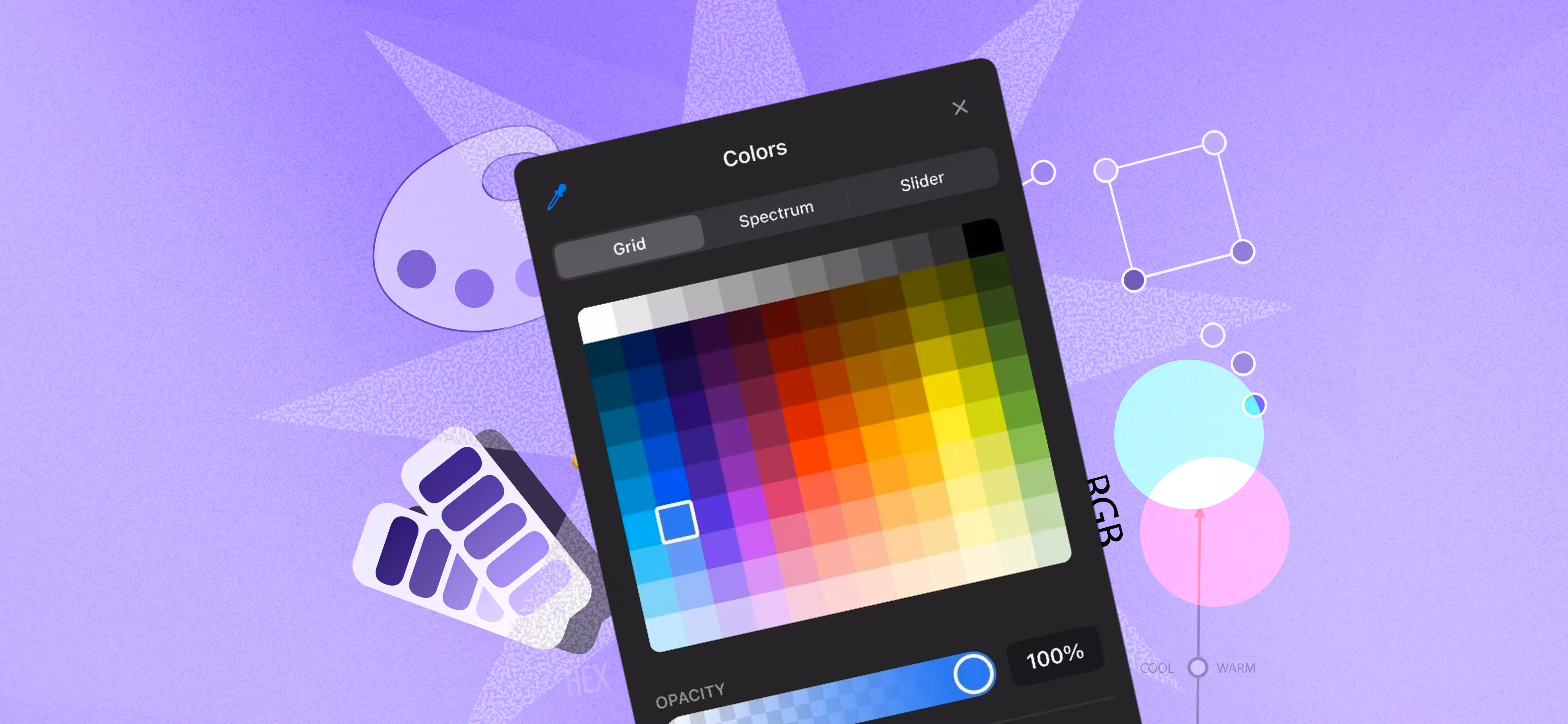
Coolors
Coolors is an exceptionally user-friendly color palette tool. New color dumping is created at the press of the space bar. It enables you to find new knowledge in a short period. In case you accidentally found a palette that you like, it is easy to adjust every shade. Accessibility features such as color blindness options are also built-in features of the tool to make sure that your palette can work with all people. The palette can be easily exported to other formats to be used in all sorts of design works.
Paletton
Paletton works in a different way where you are provided with a color wheel to work with. Begin with a single base color, and the tool will create an elegant harmony of color in schemes such as monochromatic, analogous, or triadic schemes. It is also easy to use on the part of the web designer because one can easily see how the palette would appear on a layout. It is easy to test all the possibilities by experimenting with them on the fly.
Adobe Color
Adobe Color is a good choice to the designers who have already integrated into the Adobe ecosystem. In addition to the palettes, Adobe Color provides other functions such as rules of harmony of colors to help you make a decision and make sure that all colors work well together. It is also possible to post your photos and Adobe Color will extract a palette according to the colors that are dominant in the photo. It is not only applicable in web and graphic design, but it also applies perfectly well in other fields of design.
Muzli's Colors
In case you are looking to be inspired by colors using real-life images, then Muzli Colors can be a good place to be. You are able to post a picture, and the tool will identify the dominant colors and make a pre-made palette. The tool does not only provide you with the colors but also proposes the schemes that are complementary and makes you create the balanced and fresh designs. Ideal to the person, who desires a color scheme based on the real-life pictures and trends.
Canva
Canva is a well known tool used in design, which makes color theory easier to understand. It provides ready color palettes and a color wheel and assists users to select color combinations that are in harmony. Canvase palette generator enables you to post pictures and automatically generate a palette depending on the prevailing colors in the pictures. Another feature of the platform is the Color Palette one, where it demonstrates complementary, analogous, and triadic color combinations. The easy-to-use design of Canva makes exploration and use of colors easy regardless of the type of design.
Color Hunt
Color Hunt has a rich amount of well-picked color combinations; one has to make a few clicks to be inspired. It is ideal whereby one requires a color scheme at hand quickly, yet does not want to take time to create one. There are numerous browsing opportunities on the platform, according to different moods and design styles. You are able to store your favorites so that you can use them later and apply them in your projects.
Colormind
Colormind injects artificial intelligence by applying deep learning to generate color palettes. The AI in the tool is also trained to make color combinations beautiful in accordance to popular designs making sure that you are always up to date with the trends. The base color option or Colormind beginning with a blank canvas will create attractive and contemporary palette. It is a great helper to a designer who wants to have new, fashionable color combination without trying much.
The Secret To Choosing the Right Color Scheme?
Designing the right and the perfect color scheme is highly essential to make your design more effective and also attractive. This is the information about how to choose the ideal color scheme.
Some Practical Inspirations to First Thinking.
Begin by seeking inspiration using a number of resources. An inspiration of colors may be excellent in nature, art, architecture, and the day-to-day life. See things, places, or scenes that arouse your interest. Look at the interaction of various colors in the real world. These observations will assist in generating the ideas of the color scheme of your design.
Choose the Color Scheme Mood Relevant
Each design must possess a particular mood or feel. The effect of colors in establishing such a mood is quite substantial. As an illustration, warm color such as red and orange are dynamic and vivid whereas cool color such as blue and green has a relaxing effect and tranquility. Choose what type of mood you wish to communicate. Is it playful and fun or is it more professional and sophisticated? The mentioned step will help you to reduce the number of colors to the ones that capture the message of your design most.
Consider the Color Situation of the Design
The situation under which the design is going to be observed is also a necessity. In case of example, a color scheme that may be effective in a webpage may not work in a brochure that is printed. Take into account the medium you are designing to and how colors would be seen in various conditions of light. The color that appears fantastic on a screen might not work the same way when it is printed. You must remember the way your colors will be seen under different conditions.
Match the Color Schemes and Contours
One of the best methods of picking colors is color wheel. The process can be simpler as it is possible to learn how colors interact with one another. The complementary colors, which are opposite to one another in the color wheel, produce great contrasts. Similar colors, which are placed side by side, bring a more harmonious impression. Triadic schemes incorporate three colors of the same spacing and are balanced and diverse. Test various options to determine the most effective ones to use in your design.
Design and Carve Some design and complete
Once you have chosen your colors, make some design drafts. Experiment with colors with various combinations and placements. Test the way they collaborate in different aspects of your design. Make sure that the colors and the message that you seek to convey complement one another. Vary the shades, tones or palette to fit everything perfectly. There is no need to fear trying and trying out something until you are content.
How Do Designers Select A Color Palette?
There is a lot of meaning in a color scheme. We will discuss the ways to choose a color palette that tells your brand story and appeals to your customers. The right colors are one of those that will help you narrate your story and leave a lasting impression.
Understand Your Audience
Before you make any decisions on colors know your audience inside and out. The different generations, ethnic groups, and individuals view color in different ways depending on their life experiences. Individuals of older age prefer more quiet and classy shades, and the younger generation is inclined to start with brighter colors. It is by knowing these nuances that you will be able to make sure that your color scheme resonates with your audience on an emotional level.
Carry out a little research on your target audience. What colors are they interested in? What do they like? Explore the colour schemes other successful companies are utilizing in your target market to get an idea which works. And how do you make a color statement that will not be out of style? You have to be aware of the audience you are targeting in order to make the right choice of colors.
Consider Color Psychology
The psychology of colors is the study of the mental and behavioral impact of different colors. Making your visual identity in terms of colors, you should possess bare knowledge about the psychology of colors. Some of the colors are industry-specific, and all colors have connotations.
The reason why many financial institutions and IT organizations use blue is that it is a sign of professionalism, calmness, and trust. Brands prefer to use red when they want individuals to have a different feeling about something or do something due to the positive connotations associated with these words. On the other hand, green is commonly used by the health, wellness and environmentally friendly industries since it signifies improvement, liveliness and life expectancy.
Look at what emotions you would like to induce in the viewer and then choose the colors. Do you want to feel calm, vitalized, or inspired? When you pass the right message about your business and relate with the consumers at a more personal level, then you must synchronize your color palette with these triggers of psychology.
Select Your Primary and Secondary Scheme of Colors
Now you have the opportunity to narrow down your choices because you have the information about who you are designing to, and the psychology of color. Every color palette will typically include one main color that defines the atmosphere and the personality of your brand. This color will represent your brand due to its common appearance in your design.
There should be a variety of accent colors to be used in addition to the main one. These secondary hues do not become too overwhelming, in which case they enhance the effect of the base hue. Accent colors help highlight significant areas of your app or site like call-to-action or navigation buttons.
A balanced palette consists of one primary color, numerous secondary colors and a neutral background or text color. It is worth remembering that there are no strict rules; it will be the combination of these colors that will determine the nature of your brand and the mood that you will be creating.
Keep Contrast in Mind
Opposition is important to ensure that things are easier to read and apply. Design readability is influenced by the degree of contrast between the text and the background, although the user might become disoriented by a high contrast level.
A good rule of thumb is to have a contrast ratio that is high enough so that to make important details visible to the eyes without causing a strain. An example is to put up clear cut, easy to read material with a bright background and darker font colour. Remember readability in experimenting with accent colors of the header or buttons.
Avoid The Use Of Complicated Color Schemes
In some cases, less is more as far as color schemes are concerned. Although it is often tempting to use a plethora of colors, it is possible to achieve better results with a limited palette. Excessive use of colors can disorient users and the design can be considered to be chaotic.
There are monochromatic, similar or complementary color palettes, which are some of the time-tested ones. Complementary colours such as orange and blue are placed opposite each other on the colour wheel and complement each other. The color blue, blue-green and green are neighboring the color wheel and seem to have a perfect match when combined with each other. The use of different shades of one color in a monochromatic composition gives the impression of simplicity and minimalism.
Test Your Palette
Lastly, test your palette to make sure it is practical in the real world. The variations of screens, lighting, and the devices can influence the perceived color of an object. User testing can be done to find out how your color choices will affect the user experience or can be asked of your team members.
It is important to remember that a color scheme can always be changed. Turn it around as your brand evolves or based on feedback. It is essential to be consistent and at the same time accommodate changes whenever necessary.
Wrapping Up:
In the end, mastering color in design isn’t just about understanding theory, it’s about applying it with intention. The right tools help bridge that gap, turning ideas into balanced, visually engaging experiences. When used thoughtfully, they don’t just make your work look better; they make it communicate better.
As design continues to evolve, those who can combine creative instinct with the right resources will always have an edge. Because great design isn’t accidental, it’s built, refined, and supported by the tools you choose.

Read our latest blogs and resources


Reach Out Anytime Connect with Our Team
.svg)


